Creative Direction
Three distinct creative concepts for Alpine — each a complete world with its own central idea, moodboard, visual territory, and art direction. Palette and typography are shared across all three; only the visual language changes.
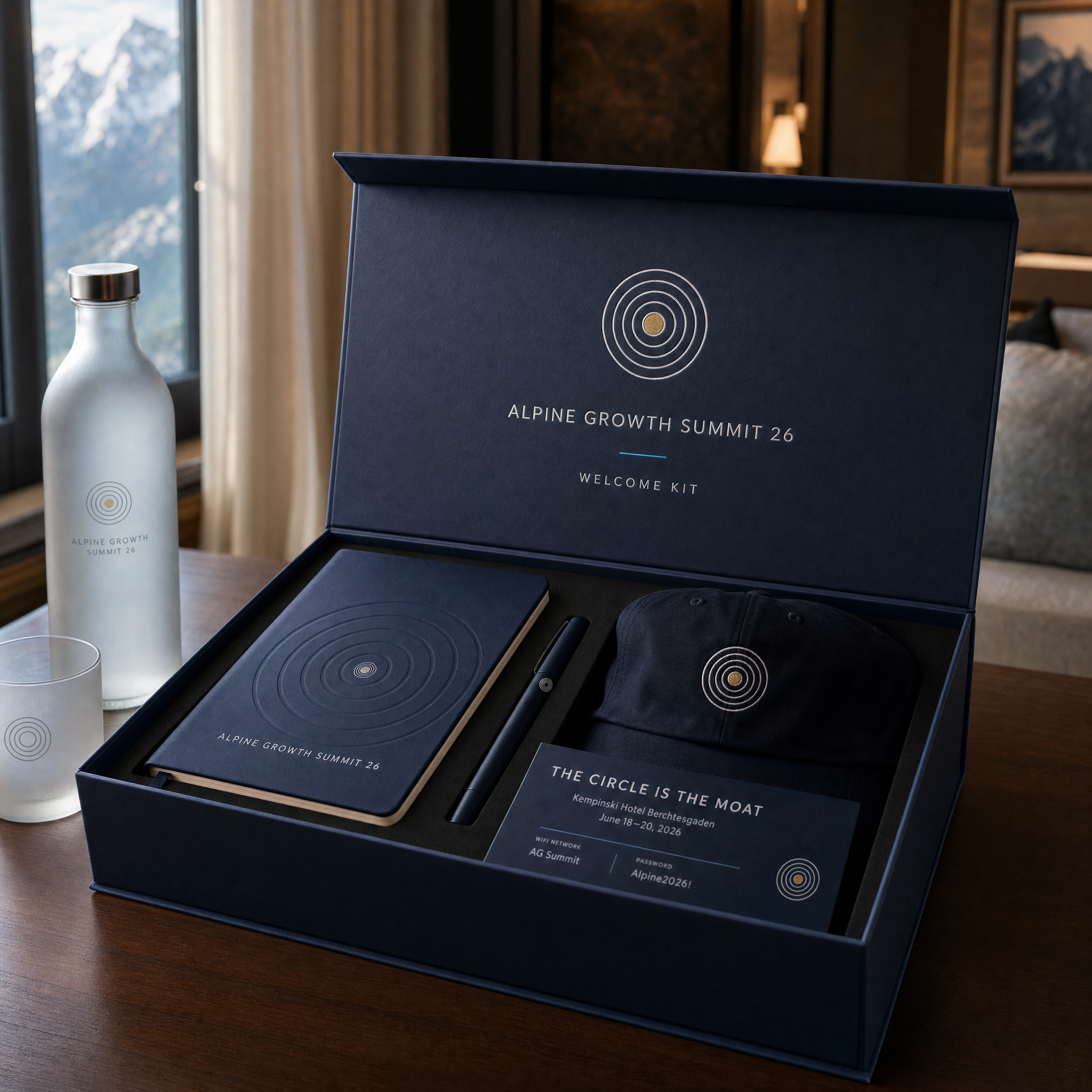
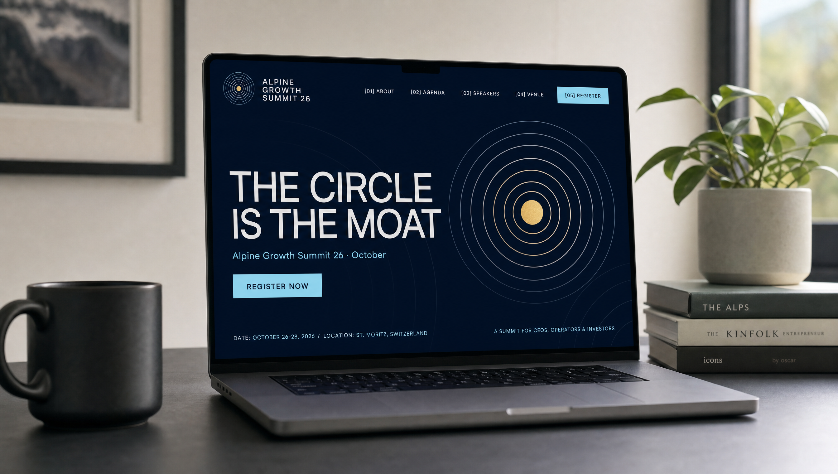
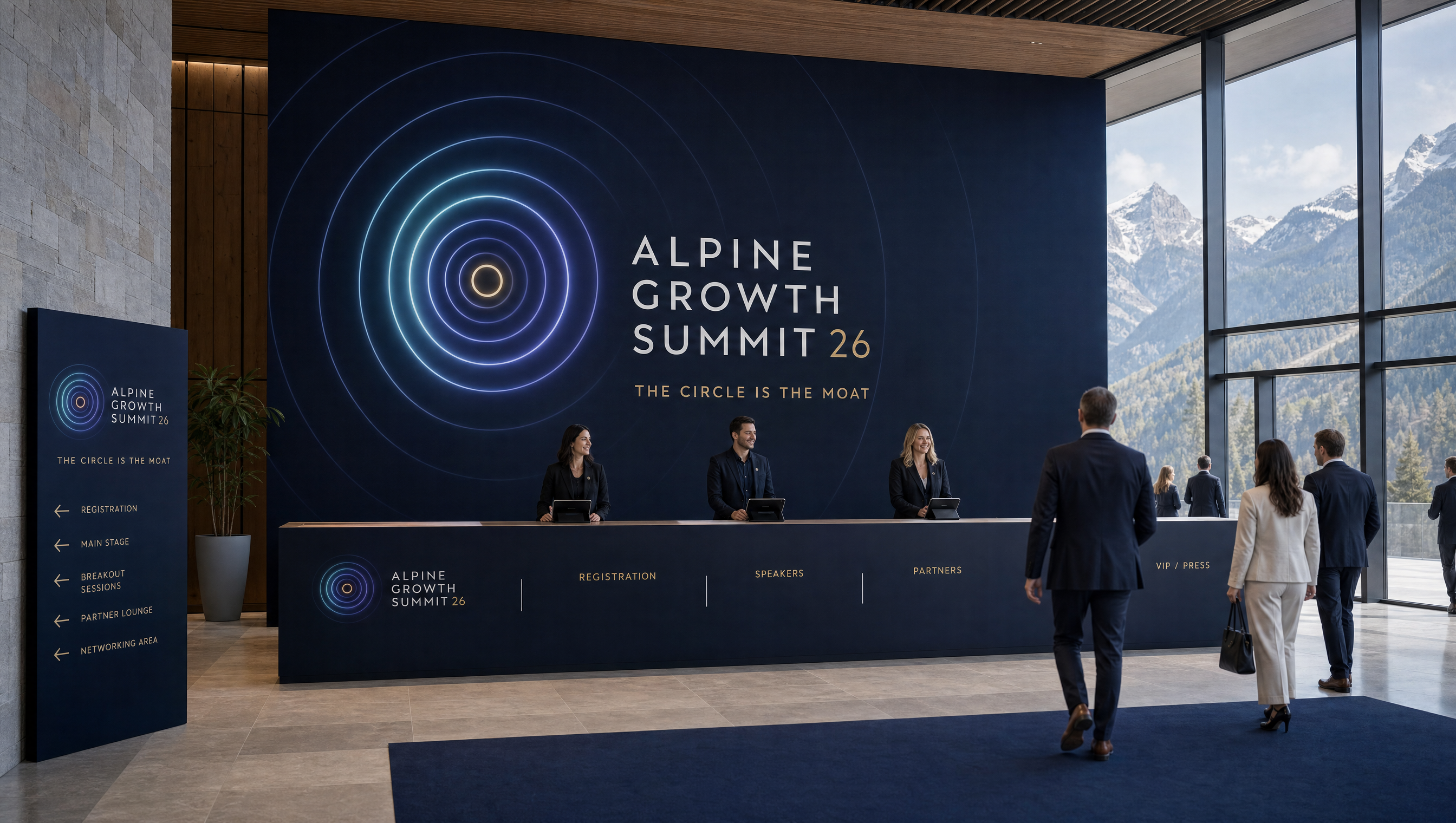
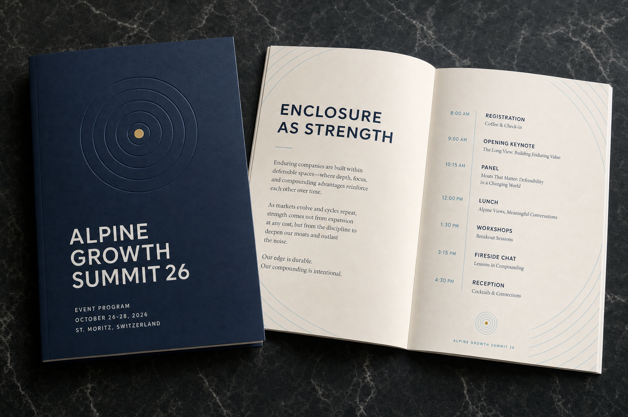
The circle as a modern moat — a protective boundary, not a castle and water. Concentric rings draw a clear line between what's inside and defended and what's left outside, expressing the layered advantages (strategy, operations, loyalty, talent, culture, capital) that compound into durable, defensible growth.
The circle is the moat. Enclosure as strength — concentric rings stack the advantages that defend a business and let it compound. A contemporary reframe of the economic moat: focus, durability, and protection over disruption and chasing what's next.
Moodboard — references & territory

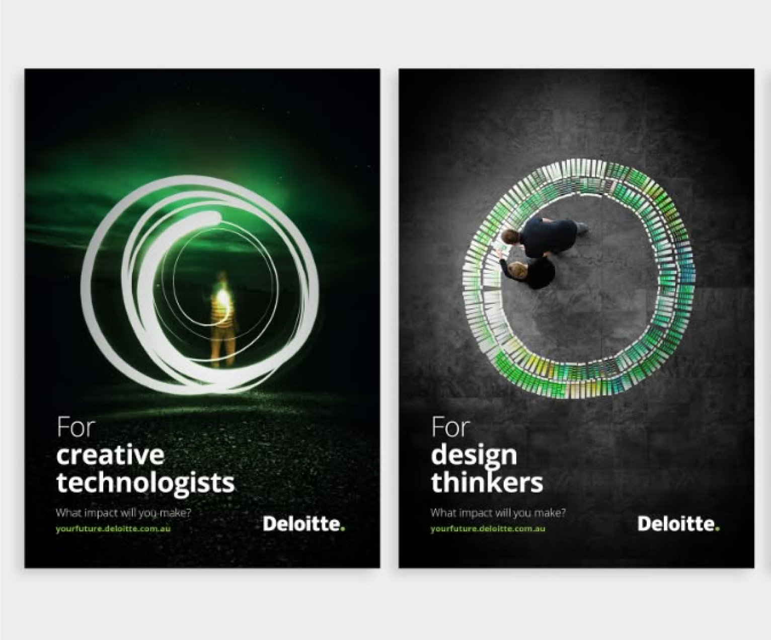

Visual territory
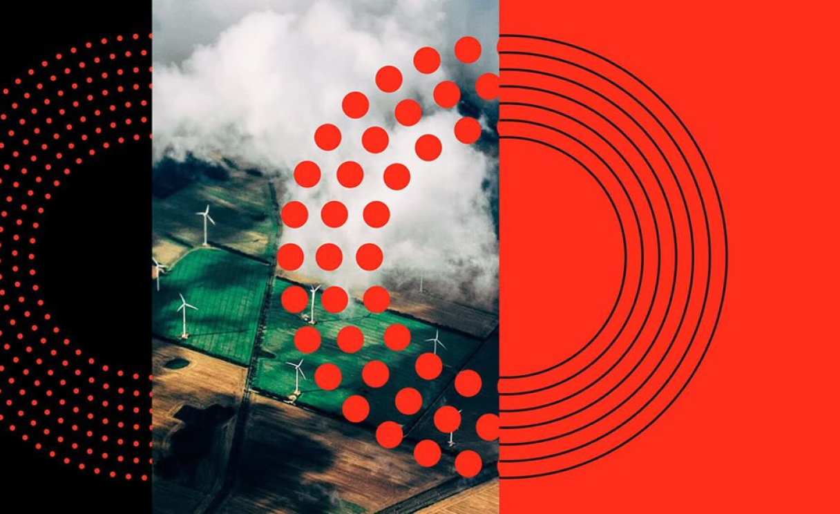
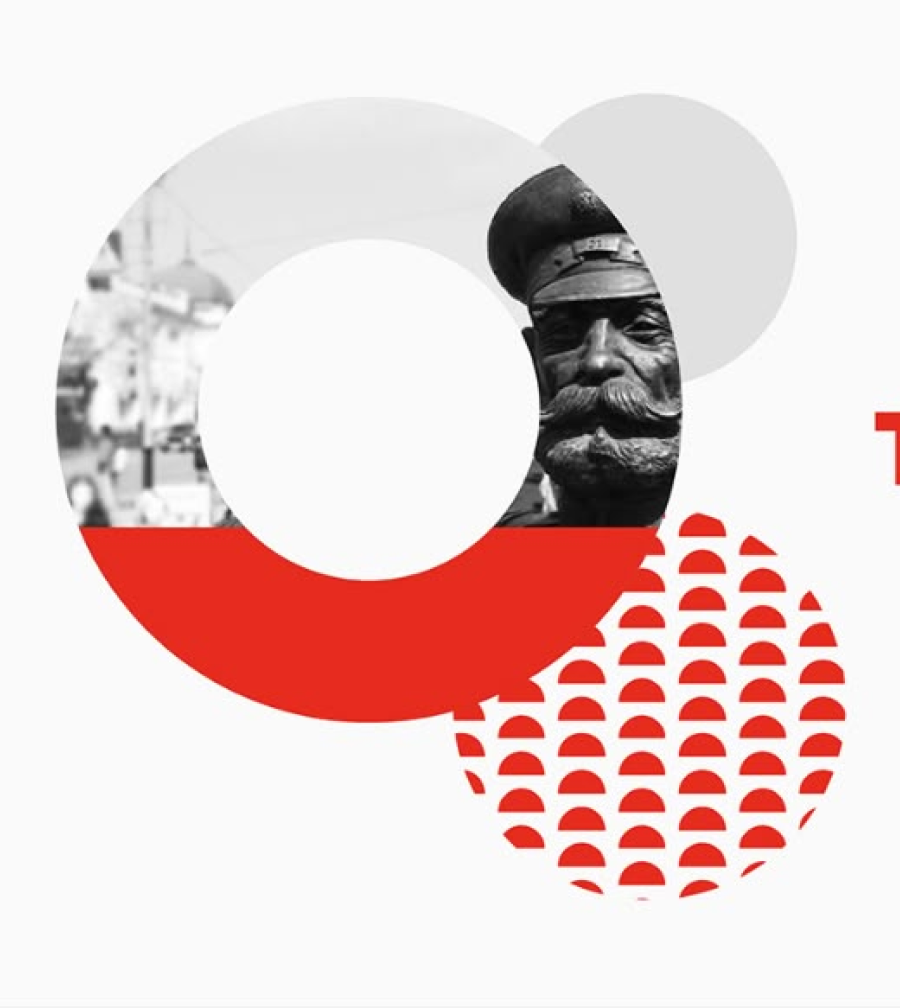
Nested rings as layered advantage — each ring a moat around the core: strategy, operations, loyalty, talent, culture, capital.
Growth built outward from a strong foundation — durable scale that compounds, not scattered bets chasing every opportunity.
The ecosystem — CEOs, operators, investors, and portfolio companies whose advantages reinforce one another over time.
Photography & motion direction
- Enclosure & protection. Forms that ring, frame, and contain — the subject held within a clear boundary, never exposed.
- Concentric depth. Rings within rings that nest and recede — defenses that layer and compound.
- Steady, deliberate motion. Slow expansion outward from a center — durability over disruption, calm and never frantic.
- Premium & systematic. Clean geometry, generous space, restraint — built to last, like the advantages it represents.
Visual studies & applications
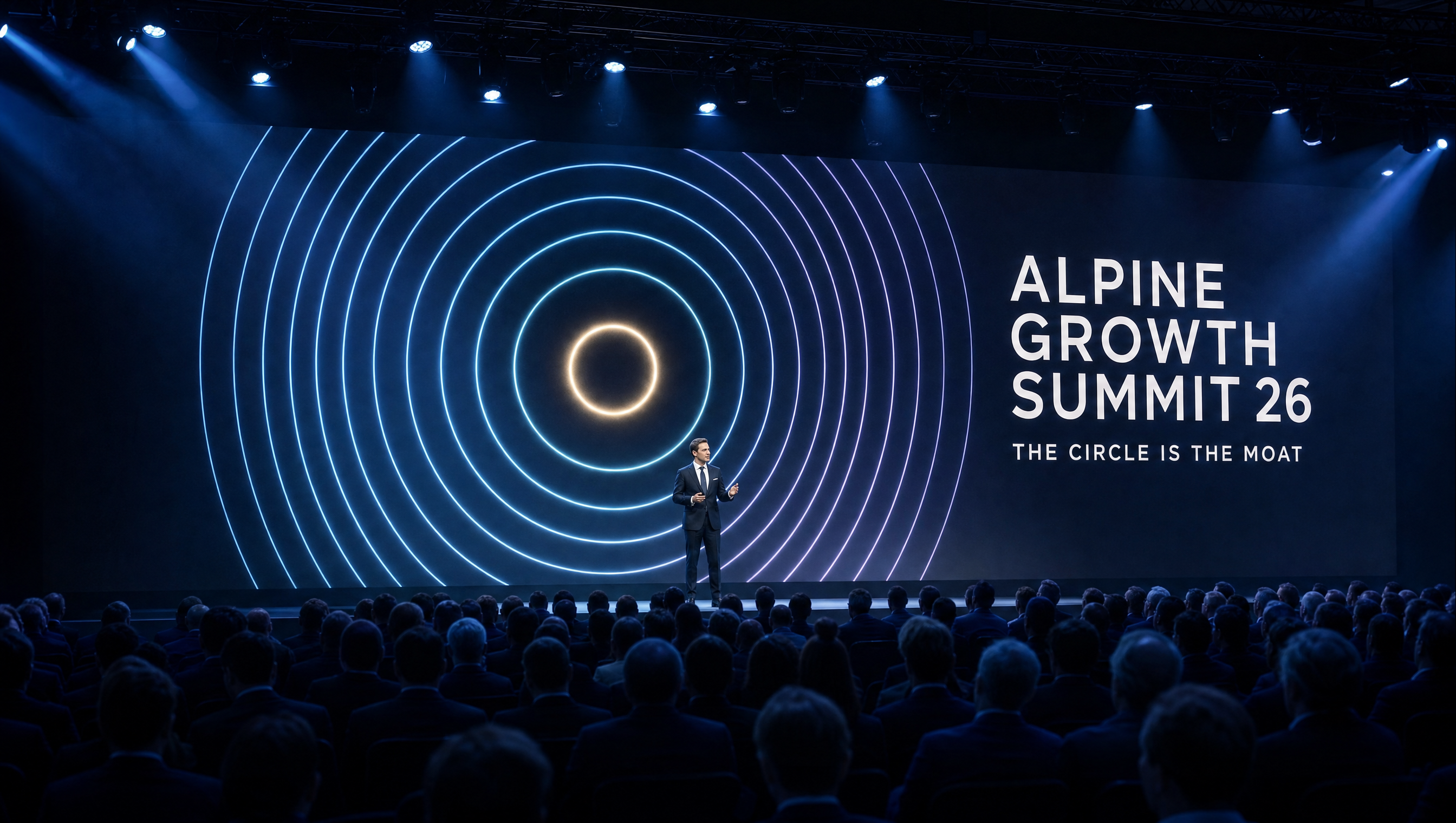

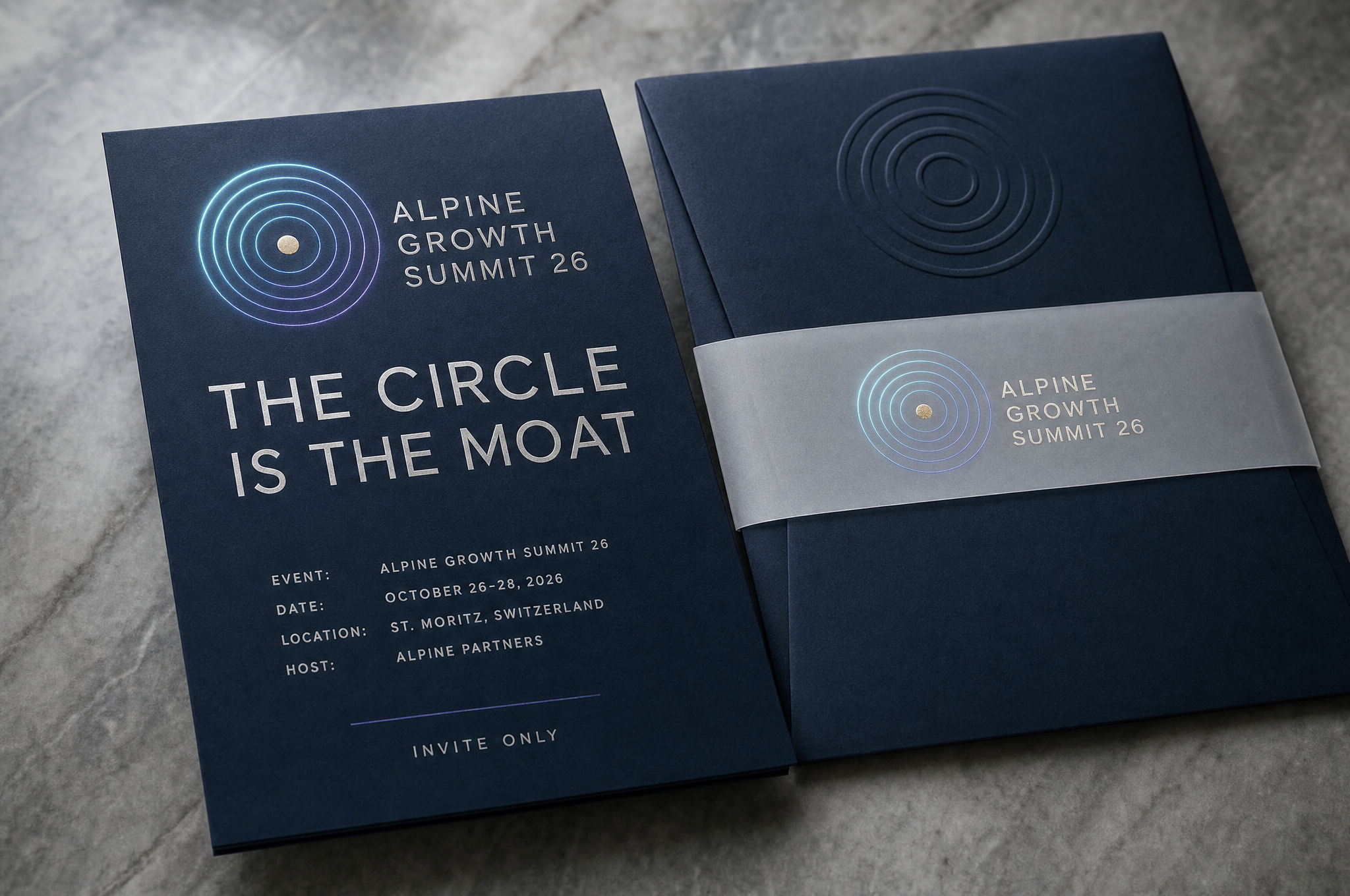
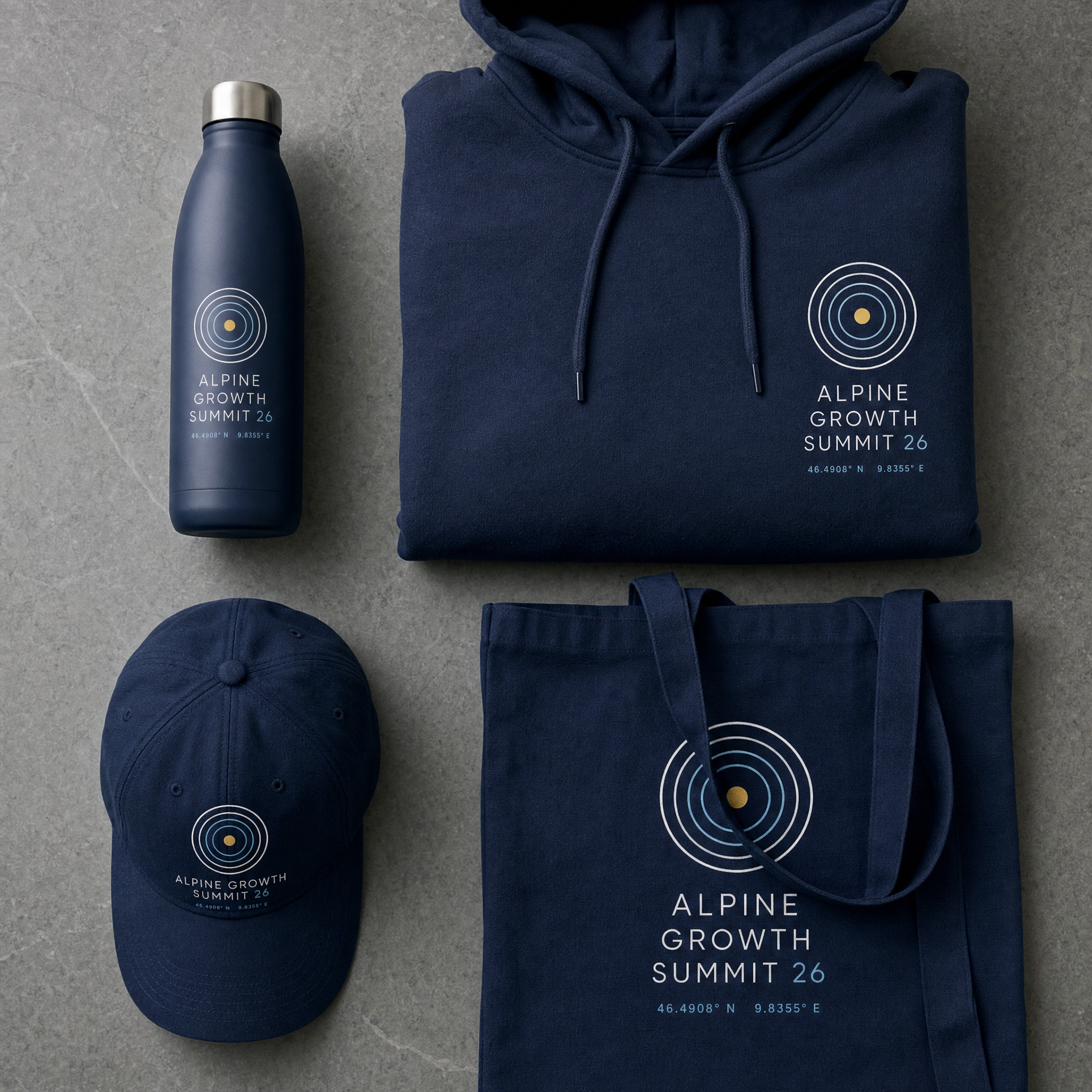

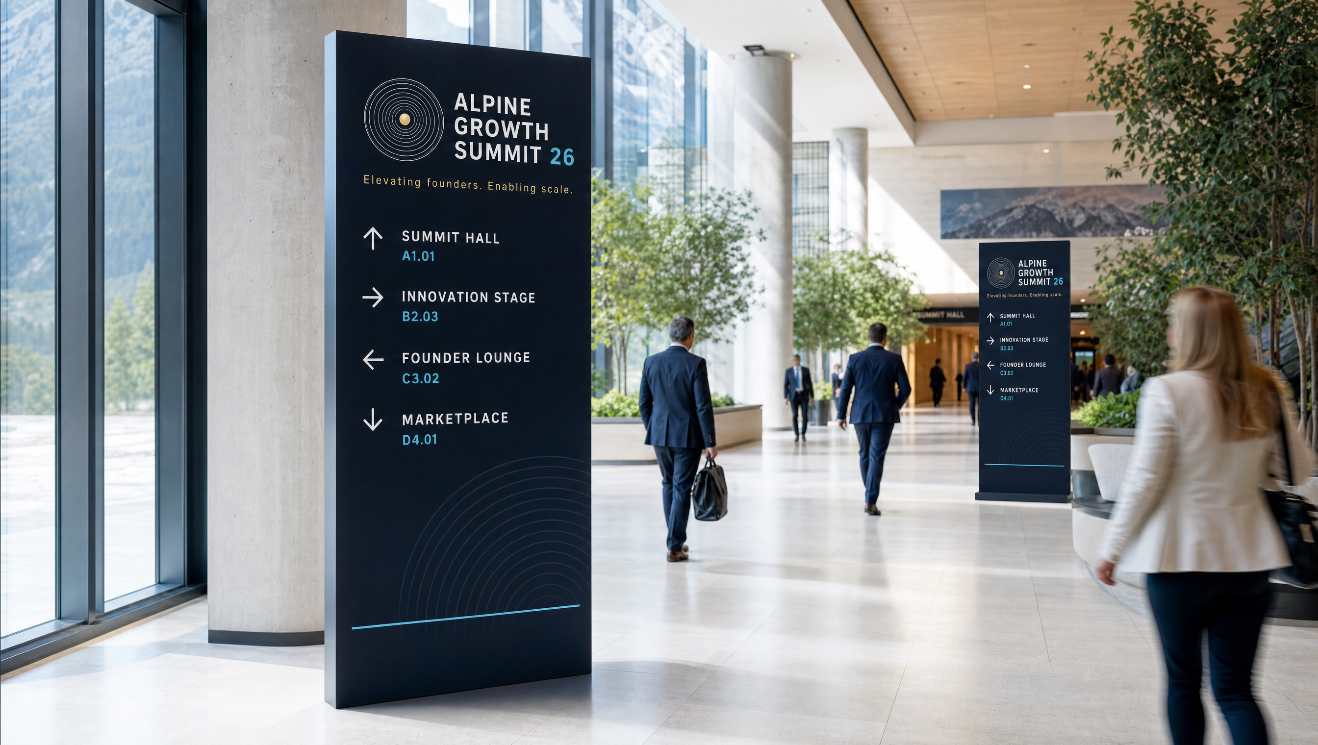
A moat begins with clear vision. The triangle — Alpine's "A" — becomes a prism that refracts one beam into many viewpoints, helping leaders see the market from every angle, separate signal from noise, and spot the advantages that matter before competitors do. Glass, prisms, and refracted light make insight the strategy.
Clarity through perspective. Great businesses don't build moats by accident — they build them through insight. The triangle-as-prism refracts one view into many, helping leaders see around corners and recognize the advantages worth defending. Clarity is what turns vision into a durable moat.
Moodboard — references & territory
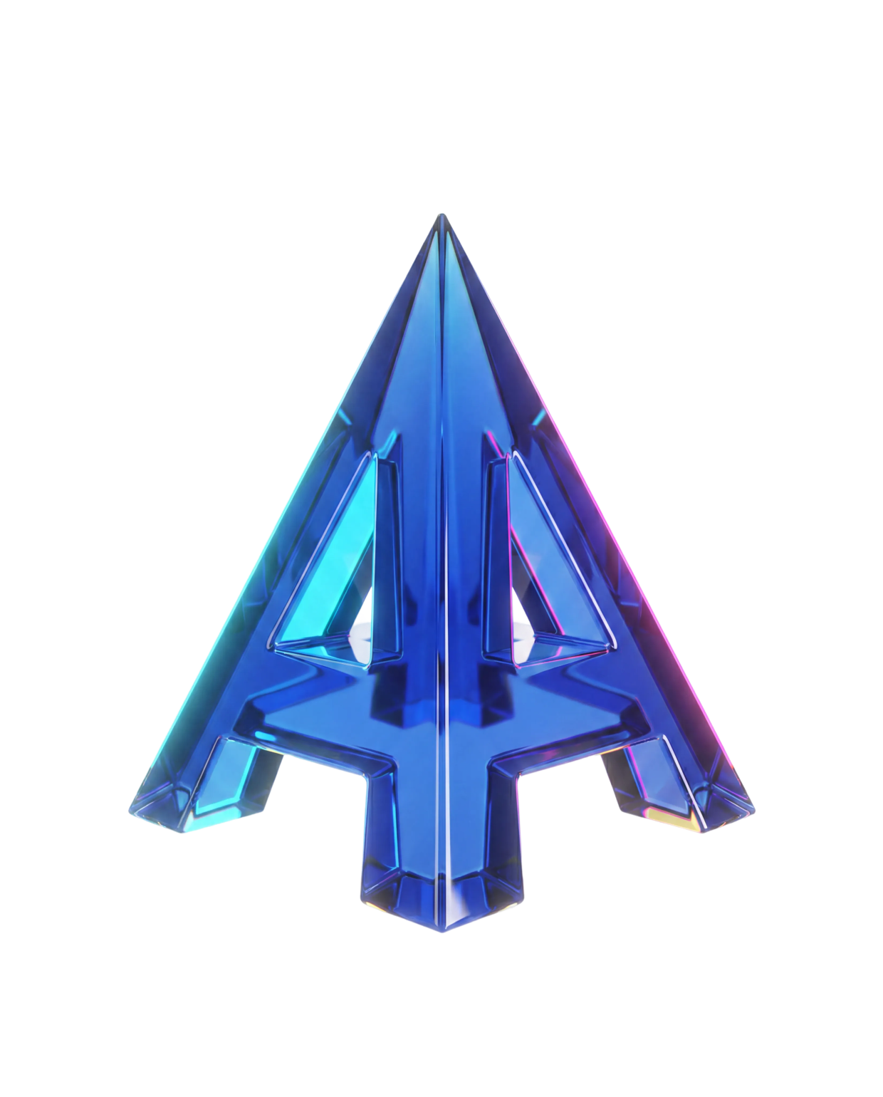

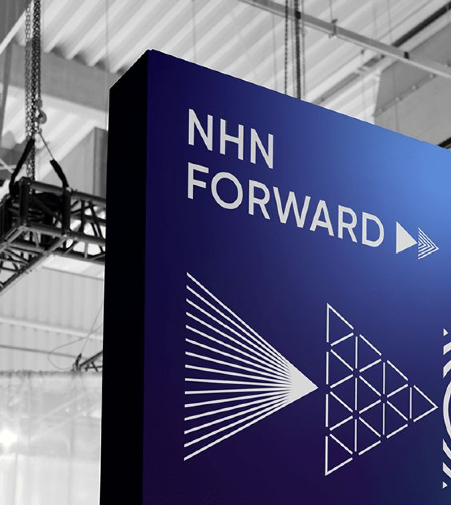
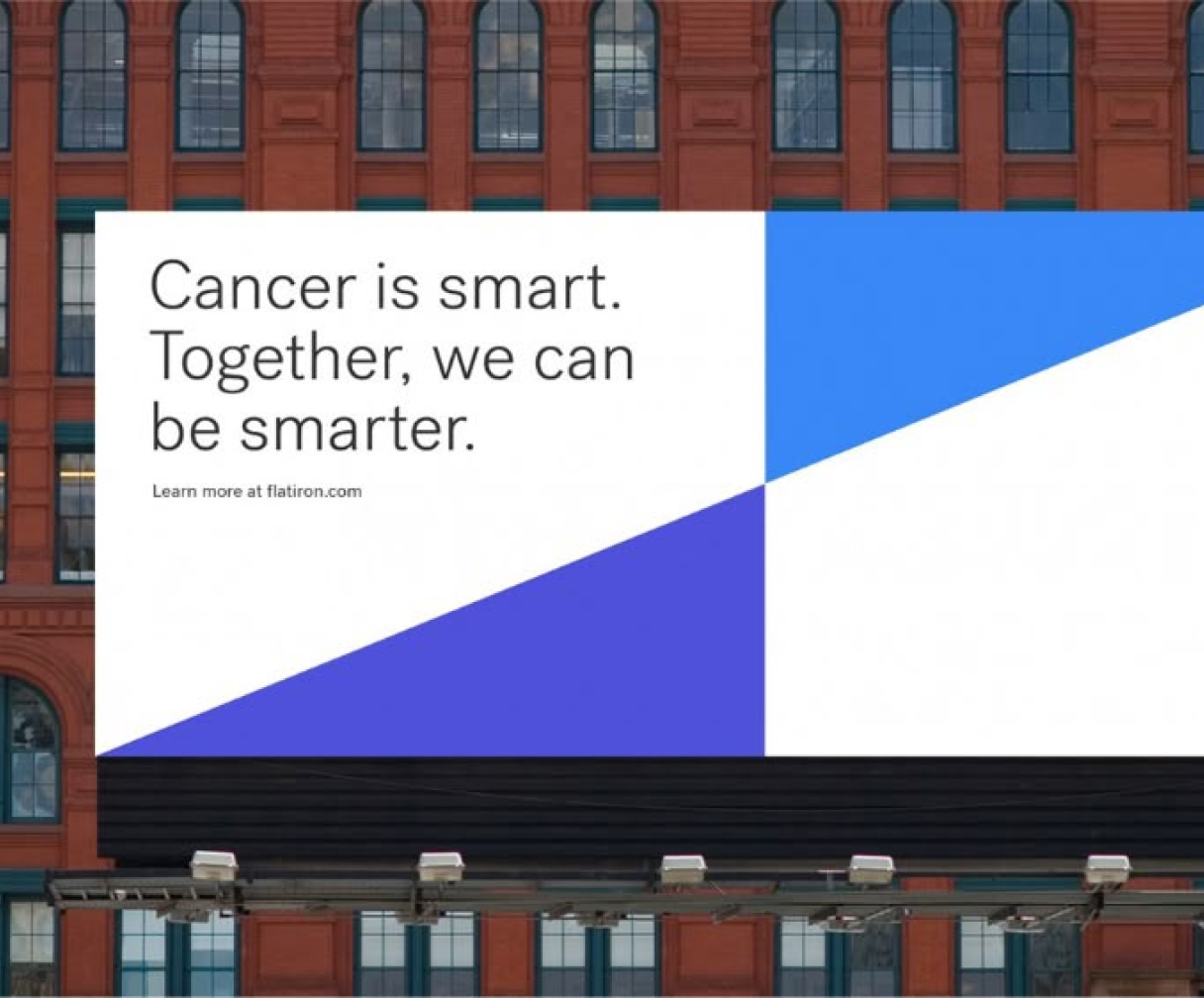

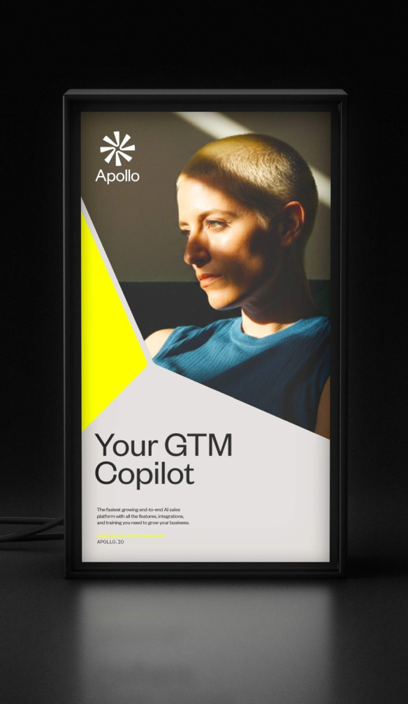
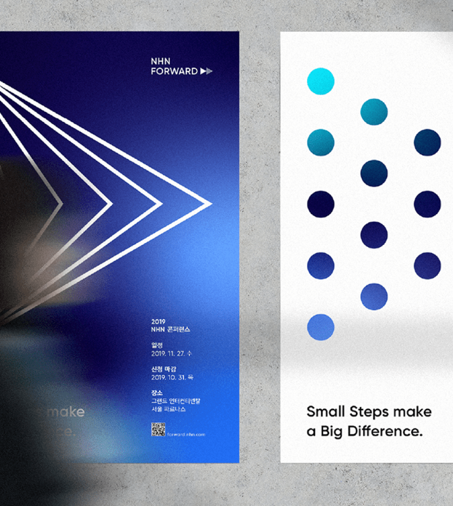


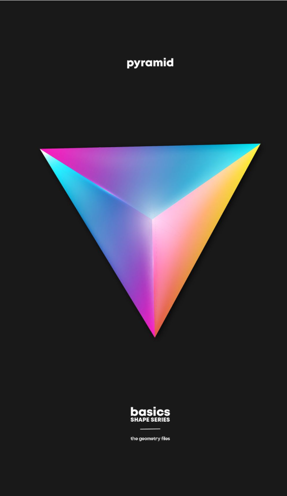


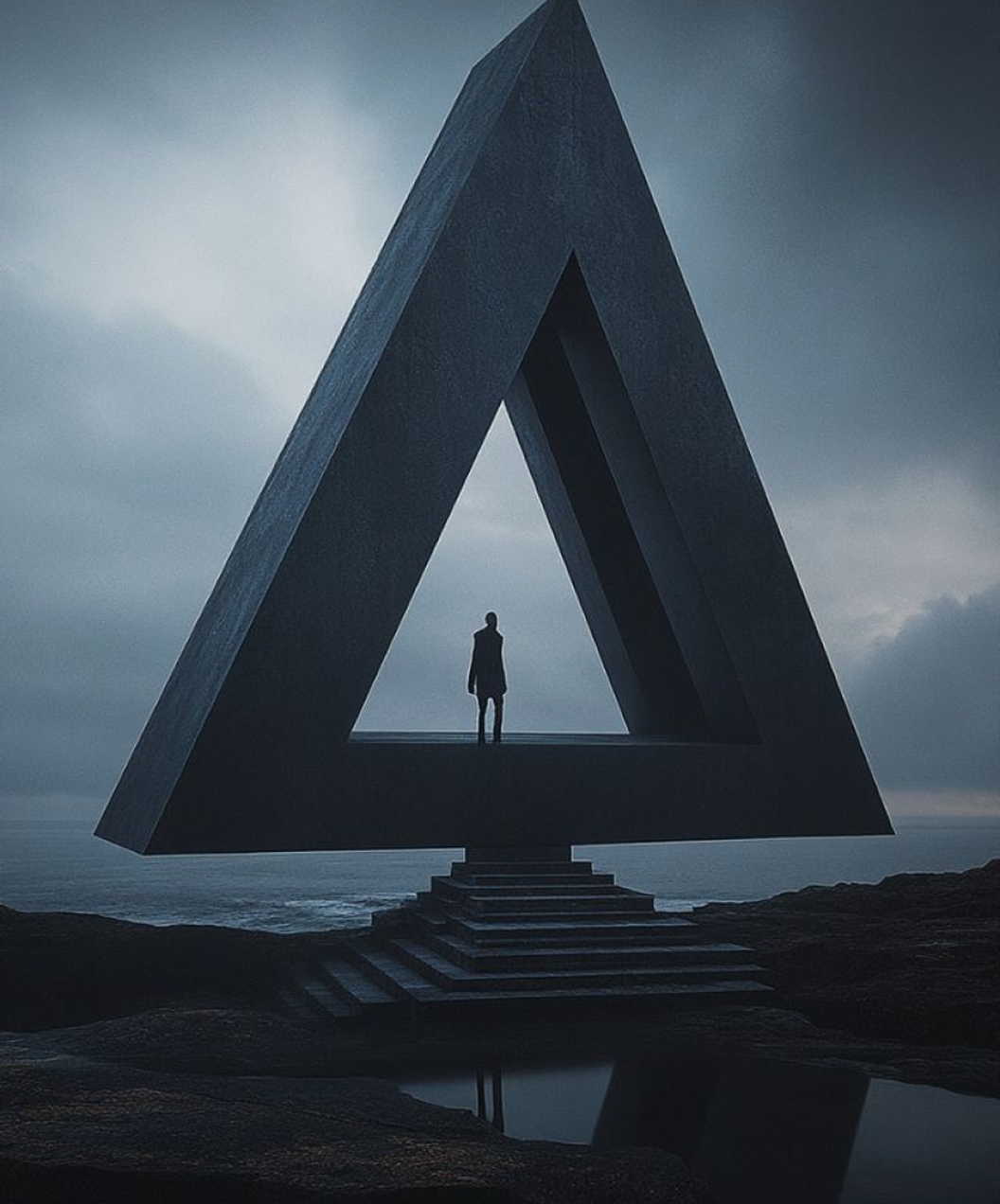

Visual territory
The summit's "A" as the core mark — a shape that focuses attention and points the eye toward the bigger picture.
Faceted glass that splits one beam into many viewpoints — transparency and reflection turning information into insight.
Converging lines and shifting vantage points — the foresight that spots threats and opportunities before competitors do.
Photography & motion direction
- Faceted glass & crystal. Refraction, depth, and clarity — premium and precise, signal cut from noise.
- Shifting vantage points. Converging lines and changing angles — the same subject understood from many sides.
- Light through the prism. A single beam splitting into the brand spectrum — one input, many revealed insights.
- Reflection & transparency. Clear surfaces and mirrored depth — seeing through to the strategic truth beneath.
Visual studies & applications
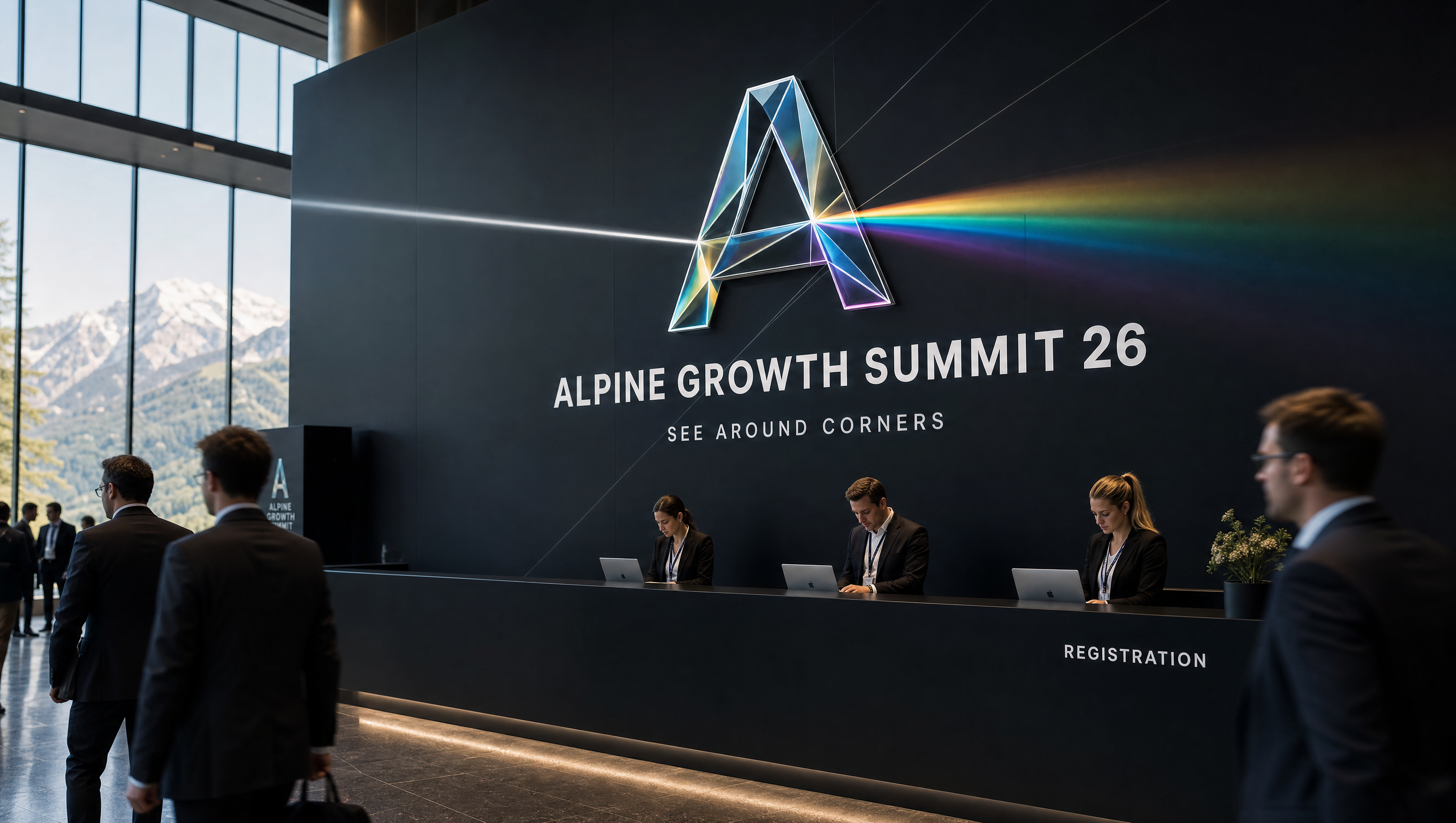
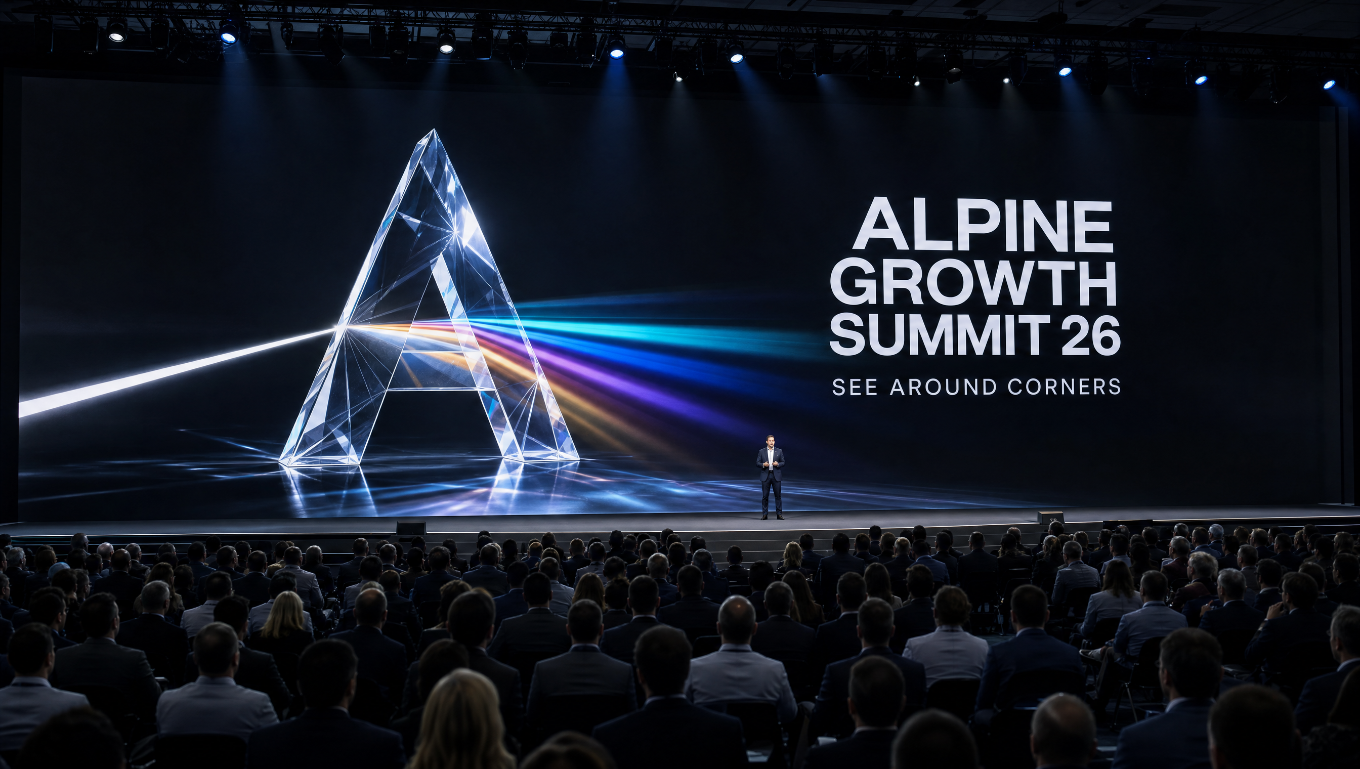
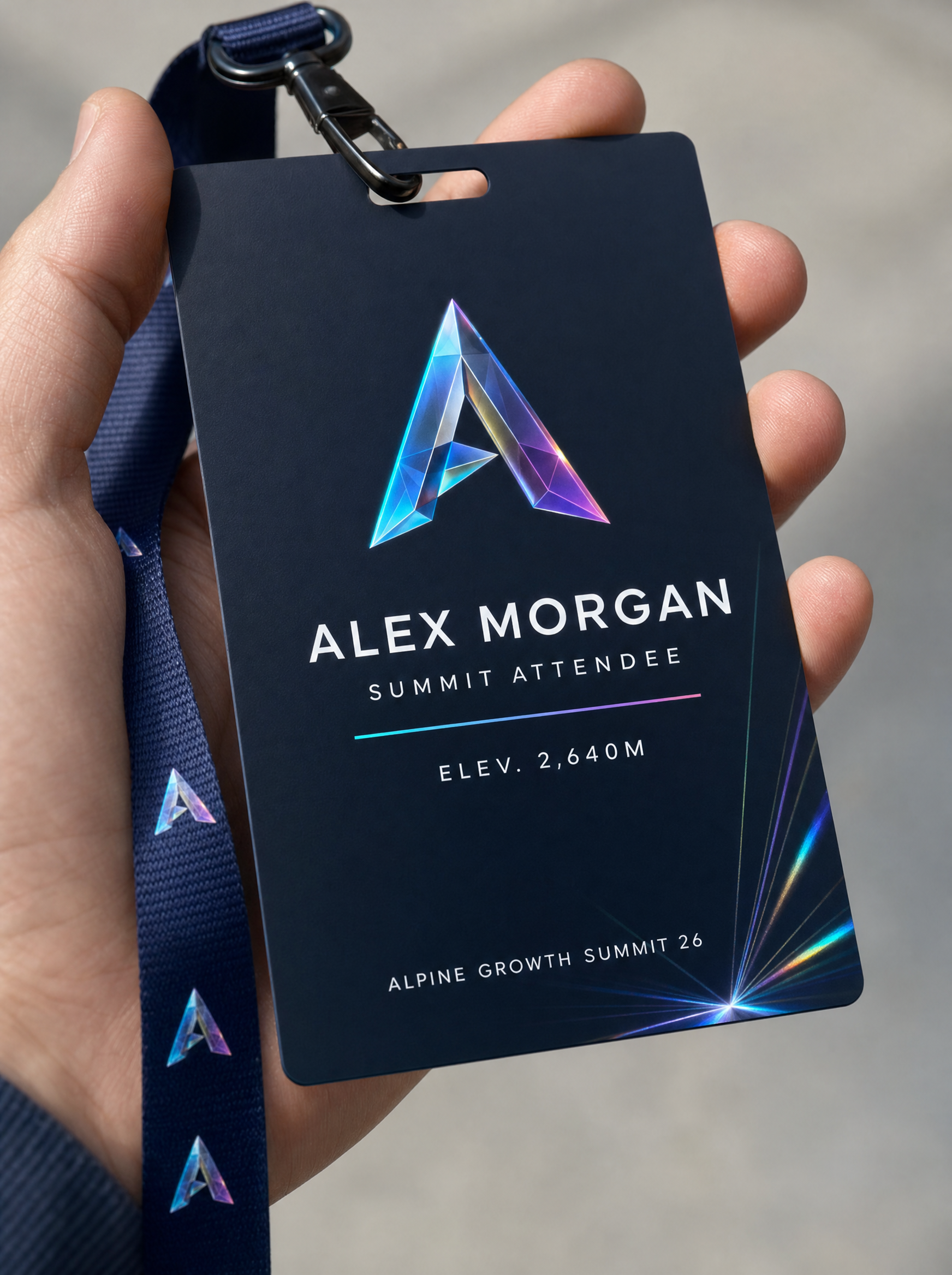

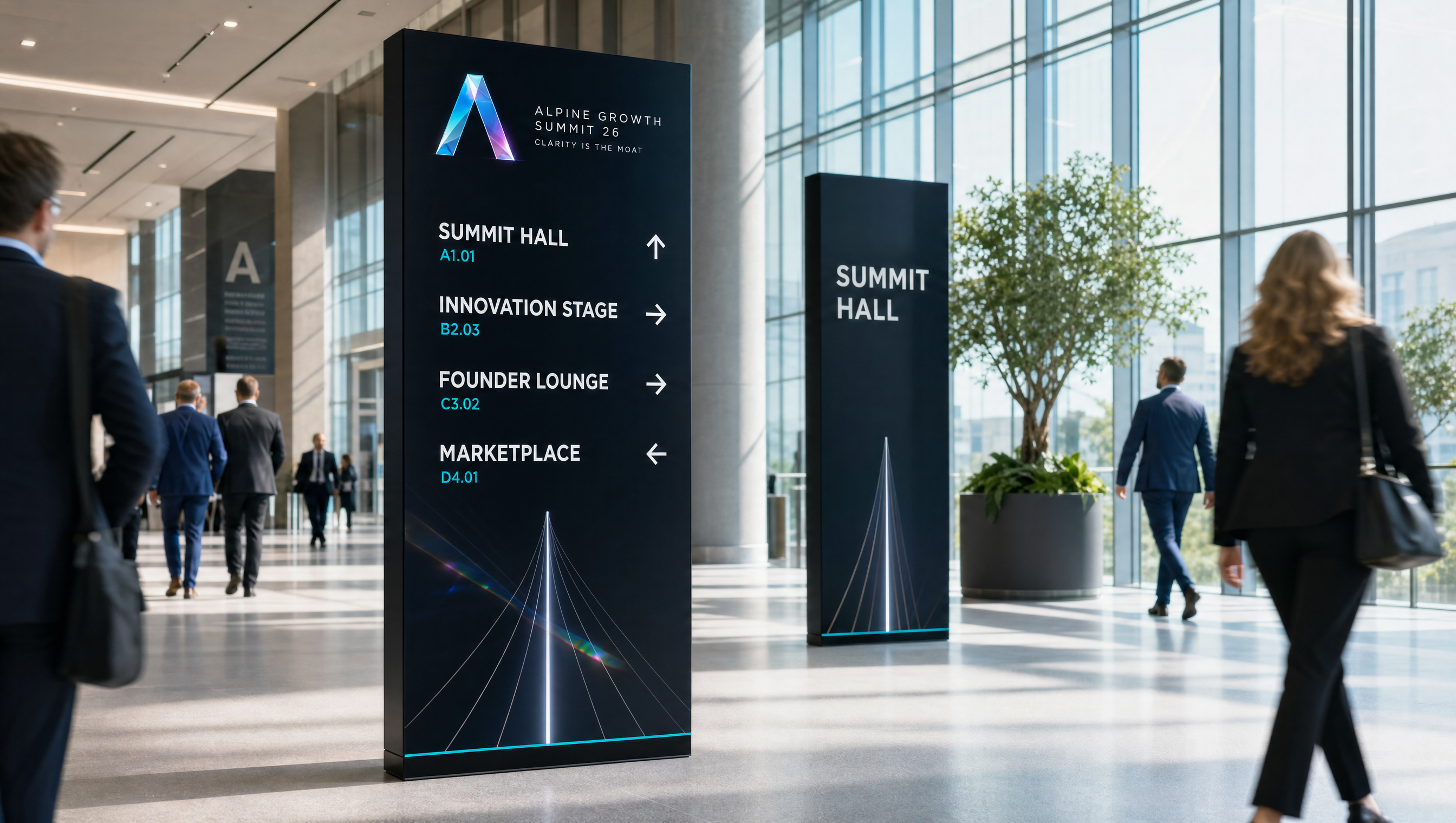
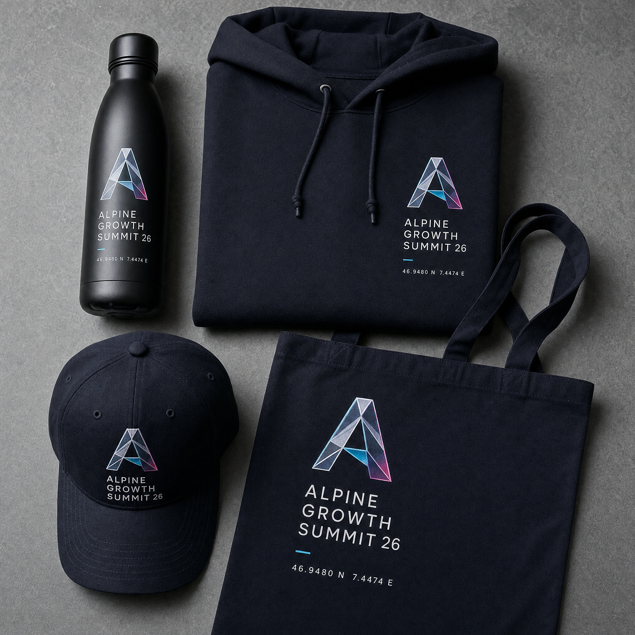
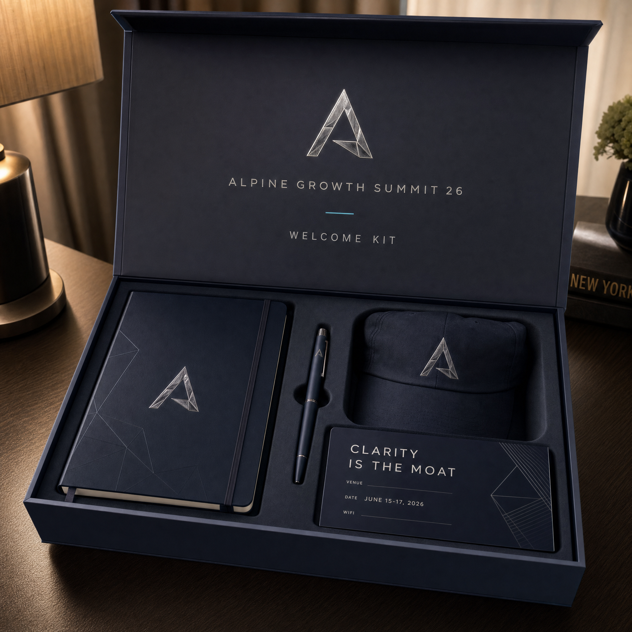
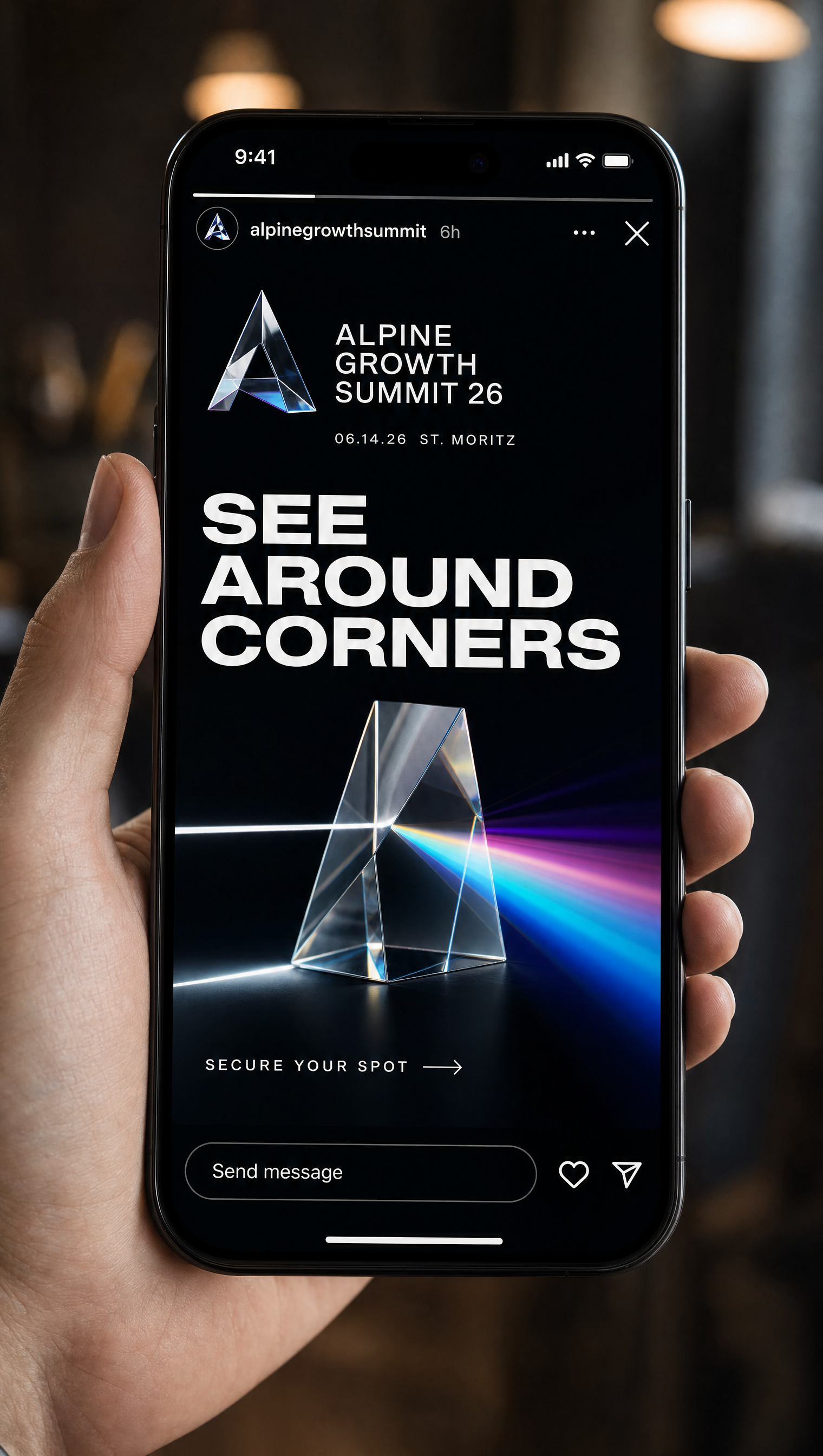
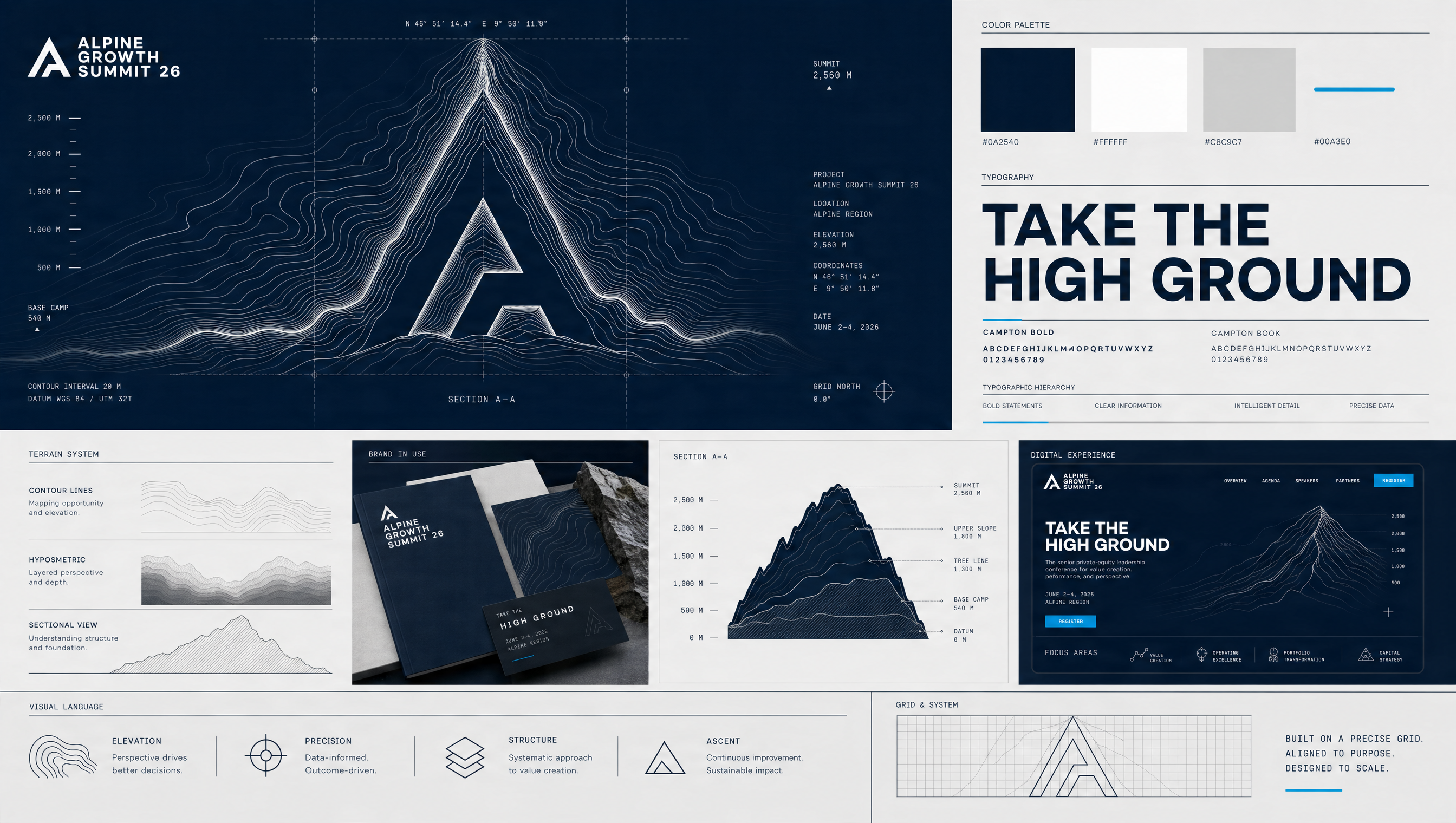
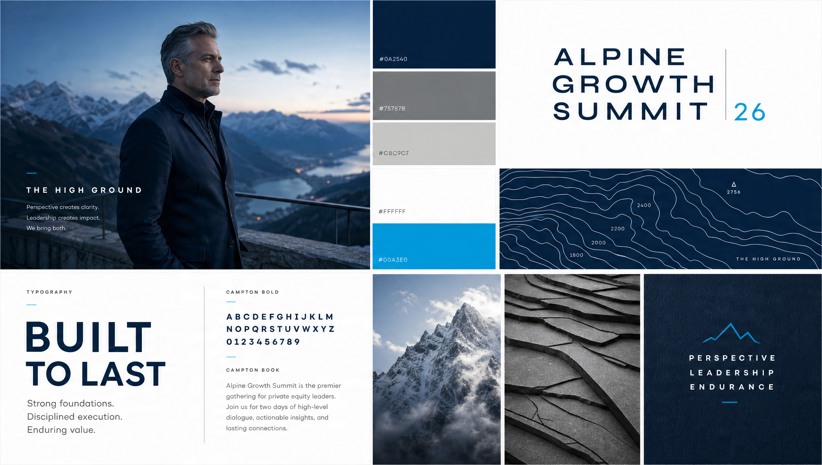
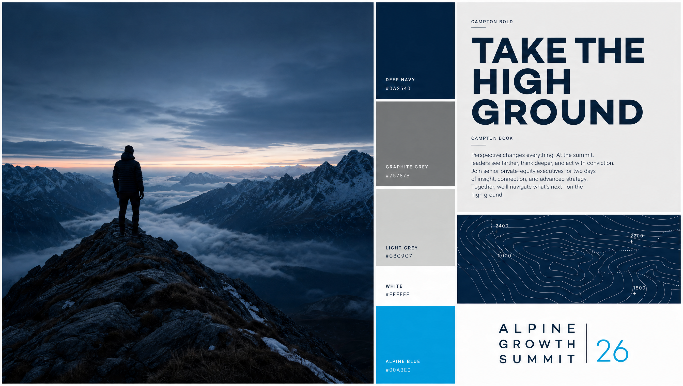
A visual system built from the mountain itself: topography, the altitude gradient, and the rope line. The climb made structural — belonging and perspective expressed through terrain and ascent, framed for a skeptical, high-performing audience. Calm, elevated, unmistakably human.
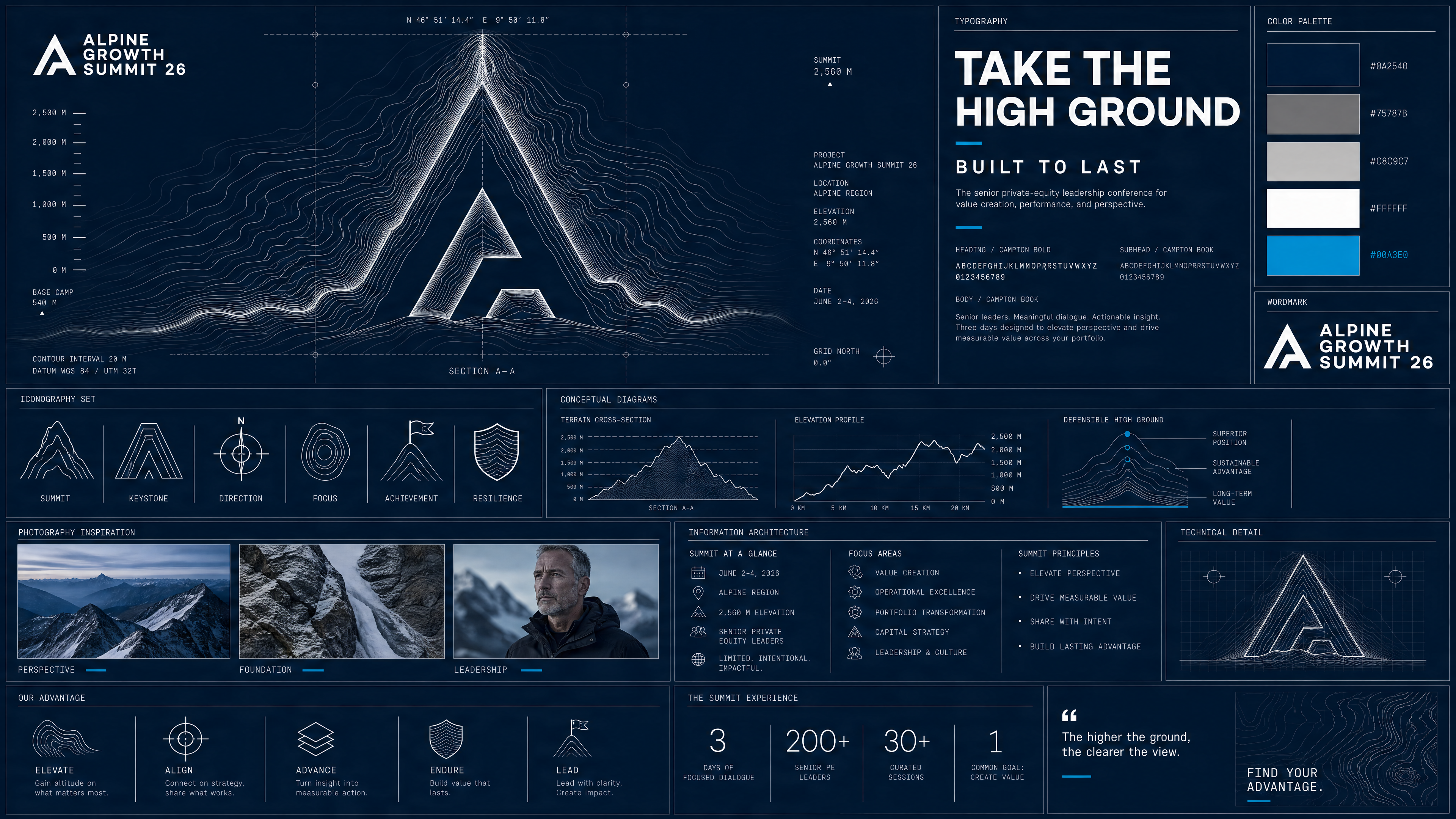
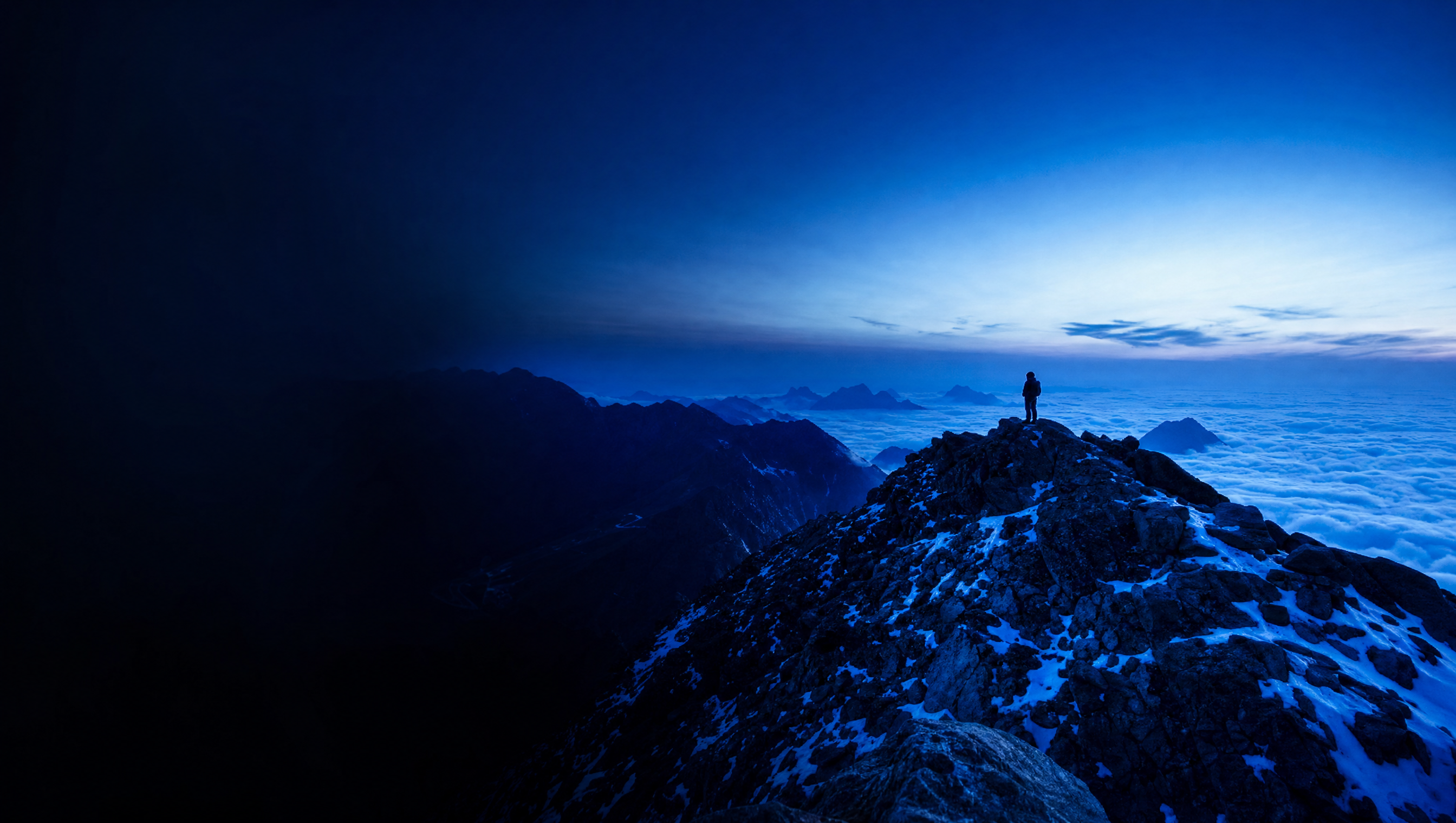
Altitude as transformation. Every asset moves the eye — and the leader — from the warm, crowded valley up into thin, clear summit air. The rope line connects people across that climb. Belonging and perspective, expressed structurally, never stated.
Moodboard · "The High Ground"



Visual territory
Contour lines are the connective tissue — backgrounds, dividers, wayfinding, data. A real terrain, abstracted into a calm, ownable line language.
A single blue spectrum rising from deep navy through electric blue to clear sky air at the summit. The one expressive move in an otherwise spare system.
A fine connecting line / knot motif signalling the rope team — links names, sections, and cohort members. Belonging as a graphic device.
Photography & motion direction
- People, not panoramas. Faces carrying weight, in candid mountain light. Real attendees and guides over models.
- Natural light only. Dawn and dusk; long shadows; weather welcome. Never glossy, never over-graded.
- Stillness over spectacle. Quiet frames — a pause on the trail, a fireside, a notebook. Motion is slow and observational.
- The climb as narrative. Sequences move valley → ascent → summit → return. The return matters as much as the peak.
Visual studies & applications
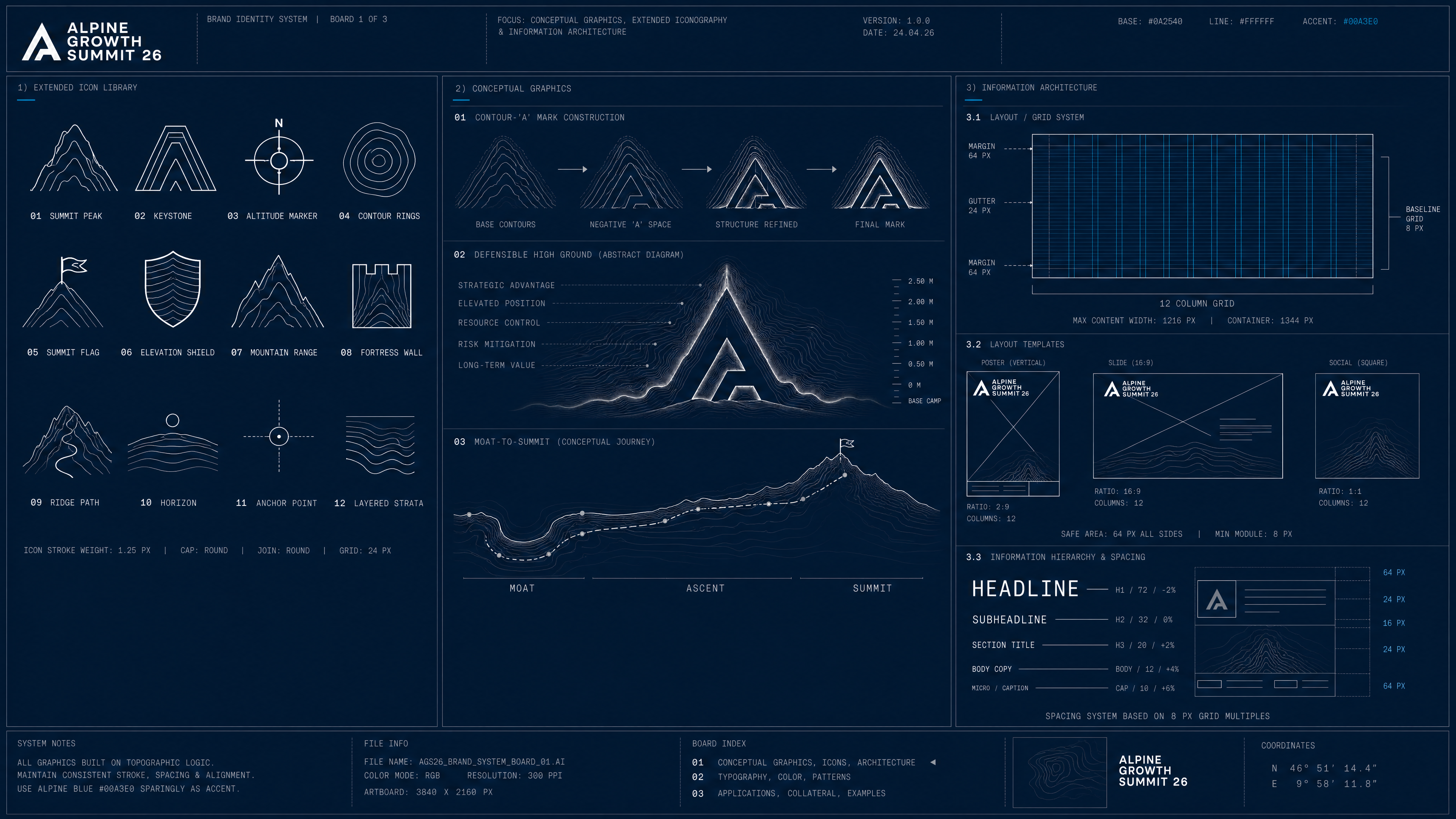
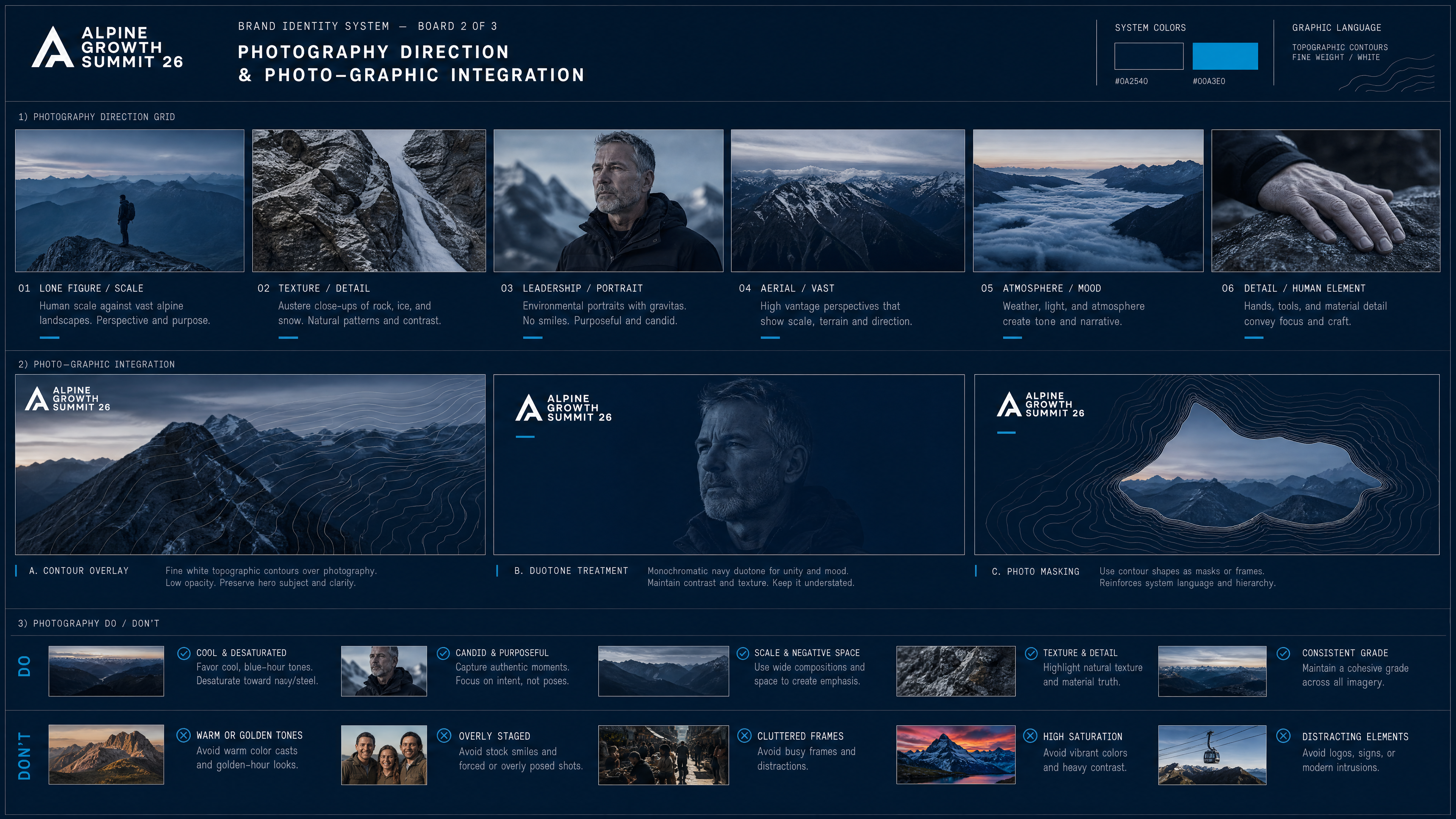
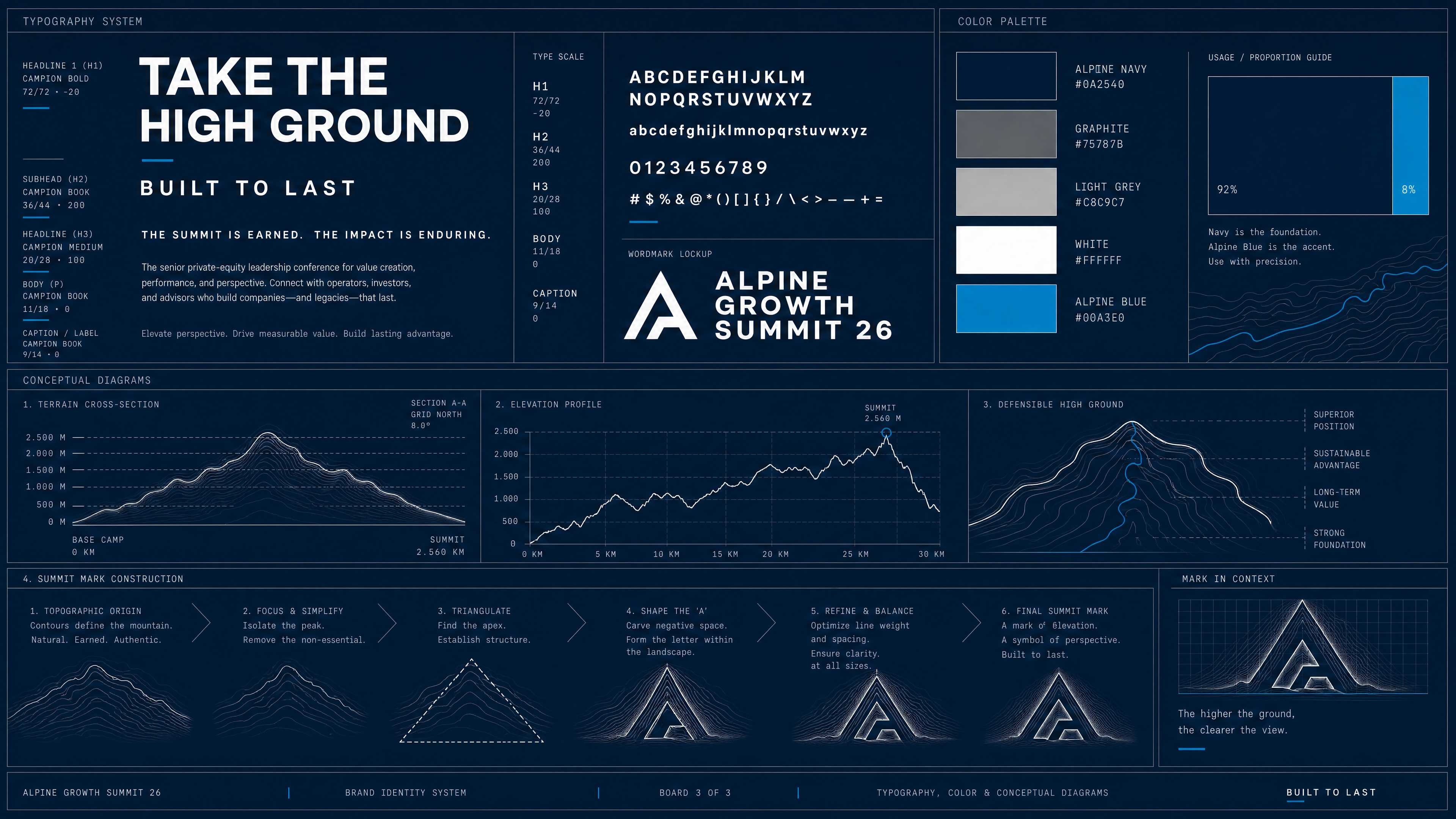
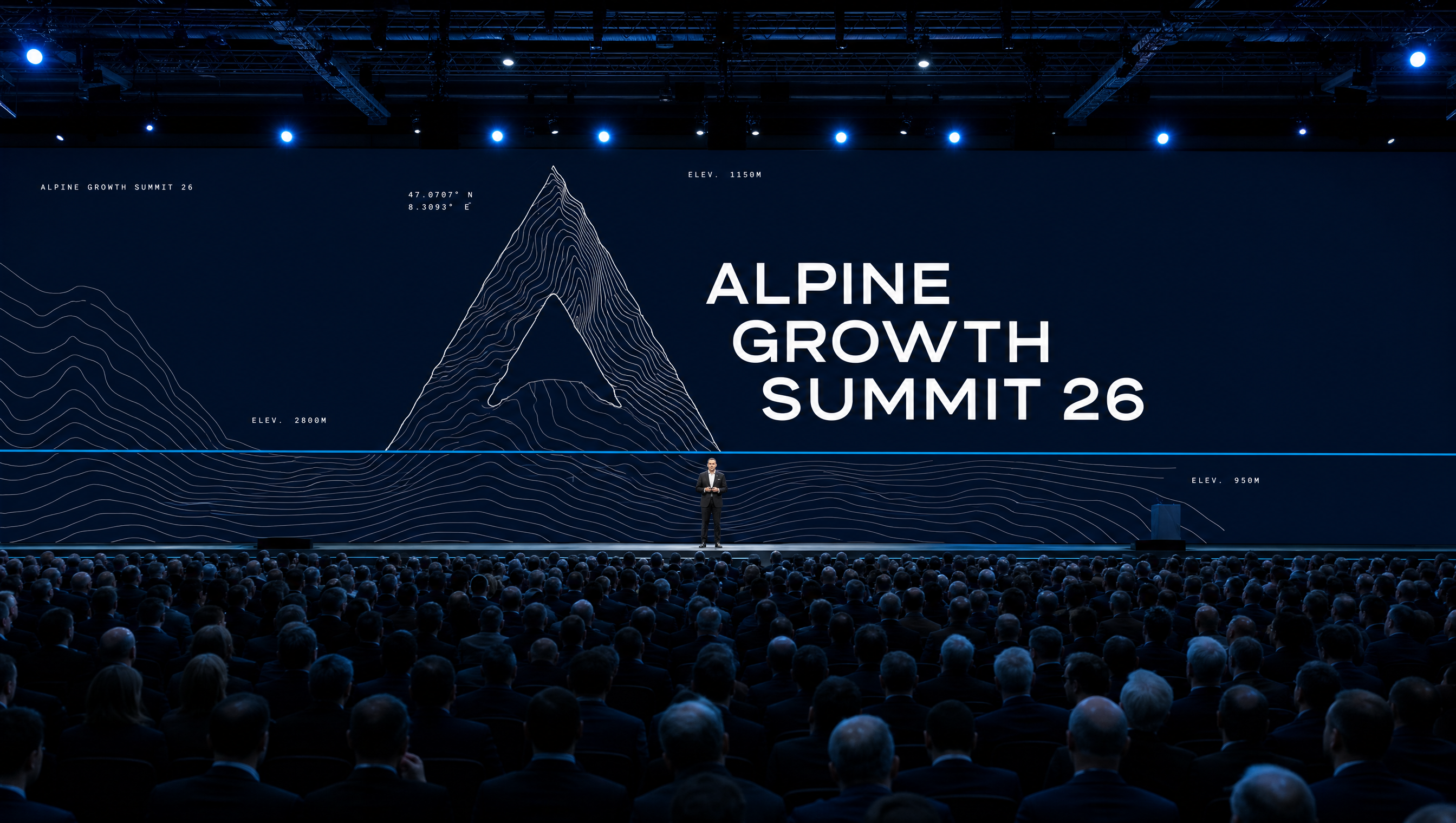
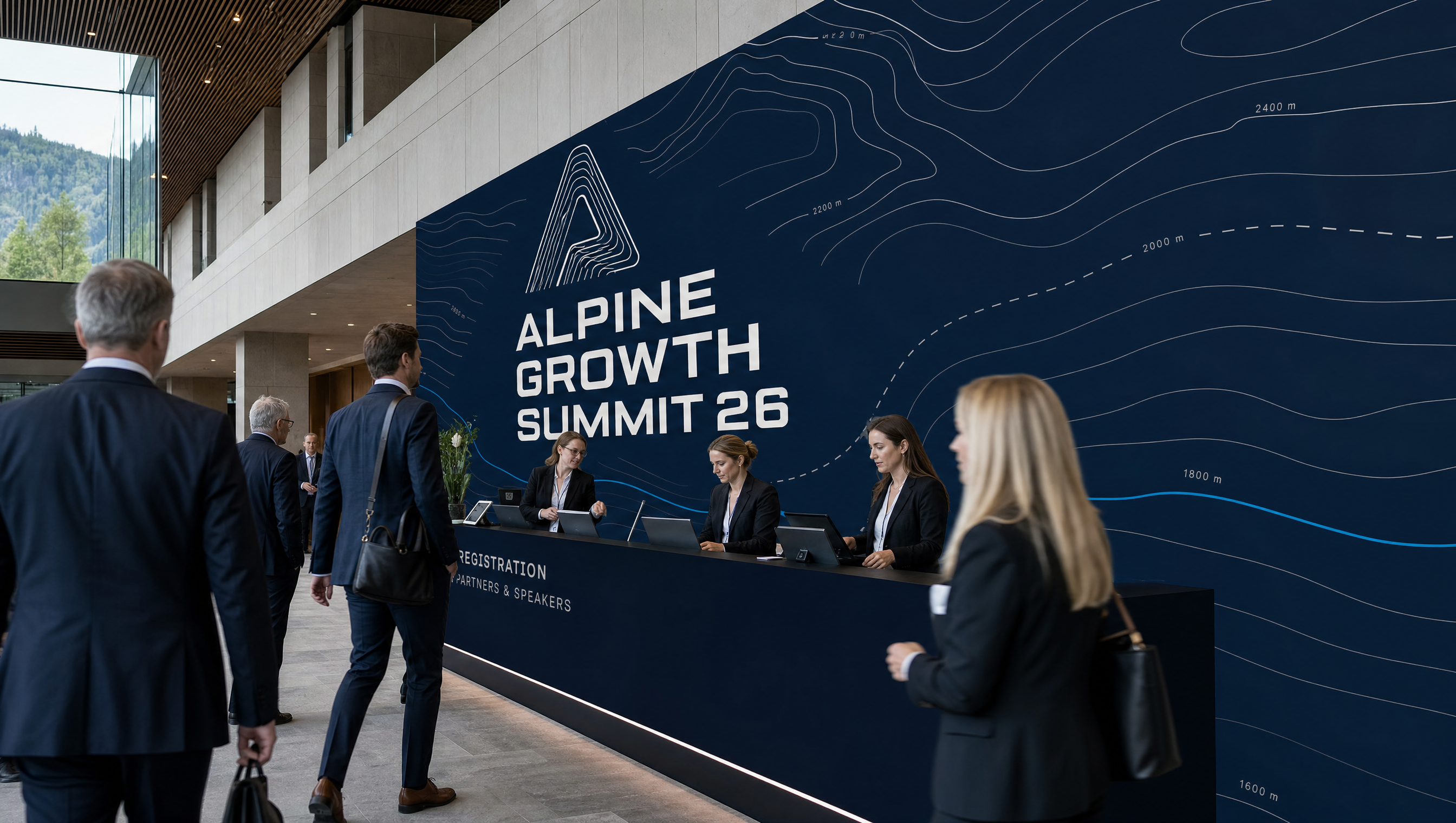
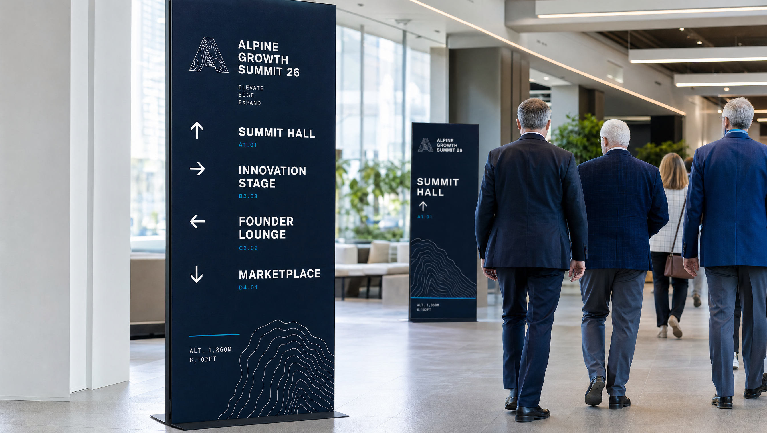


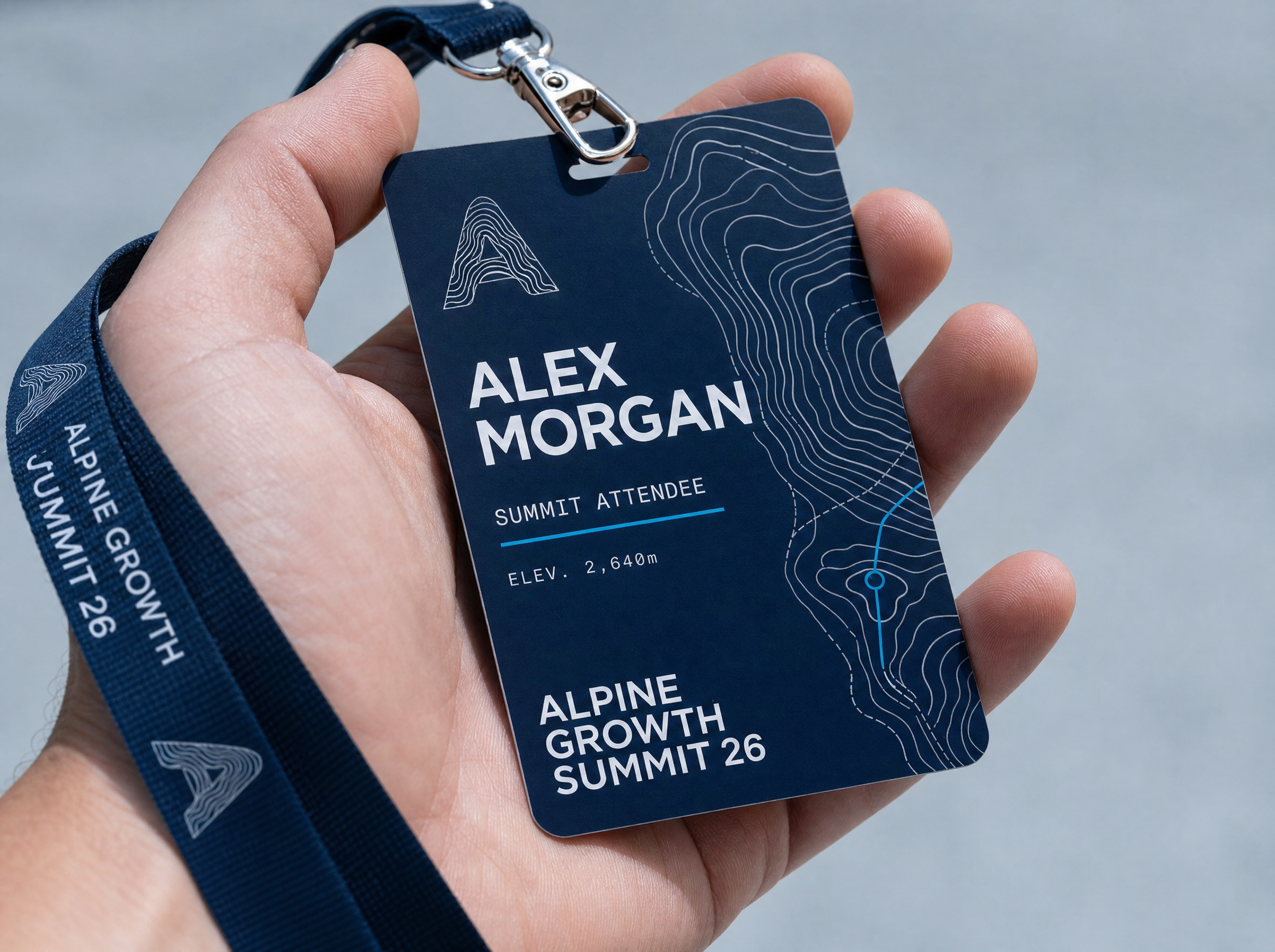
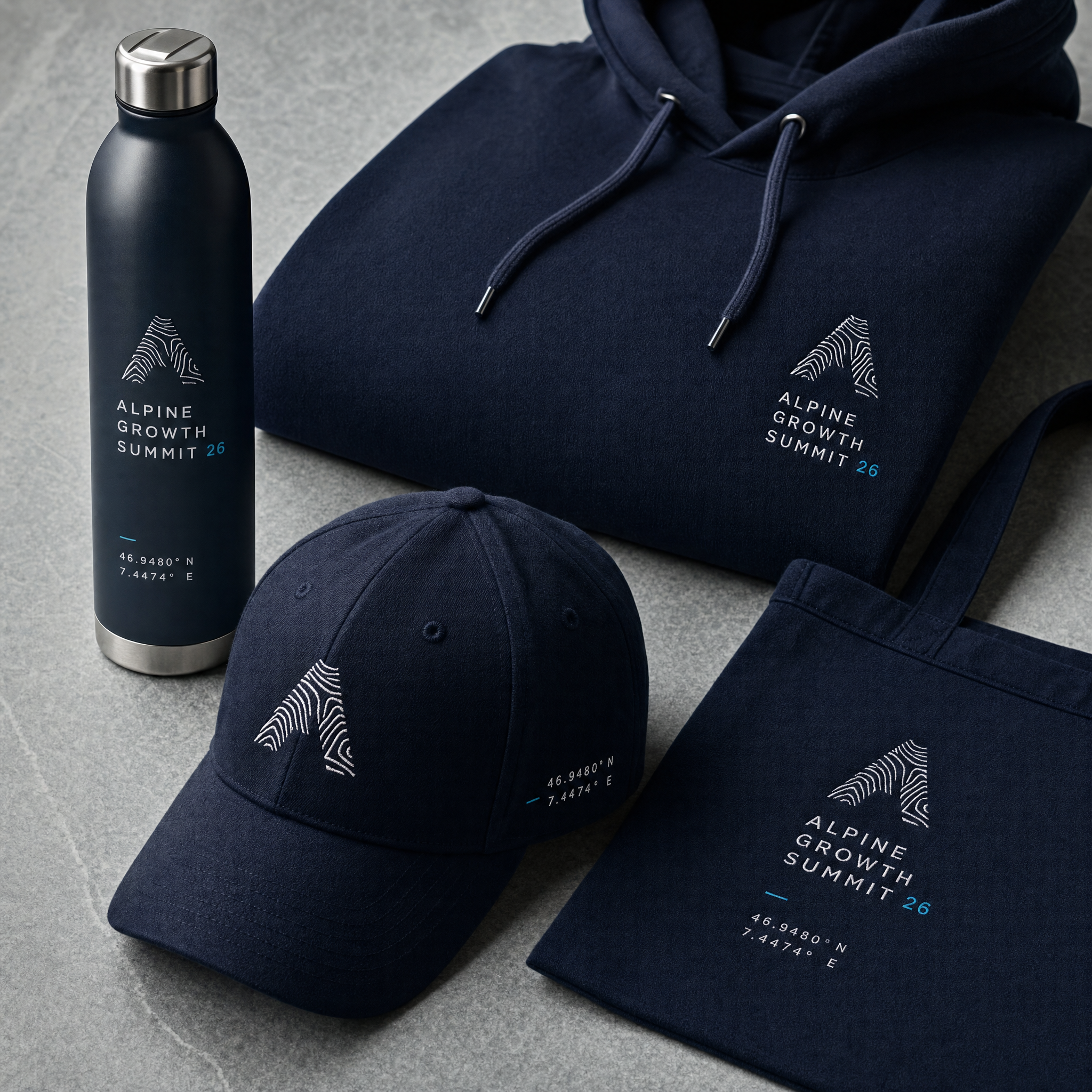
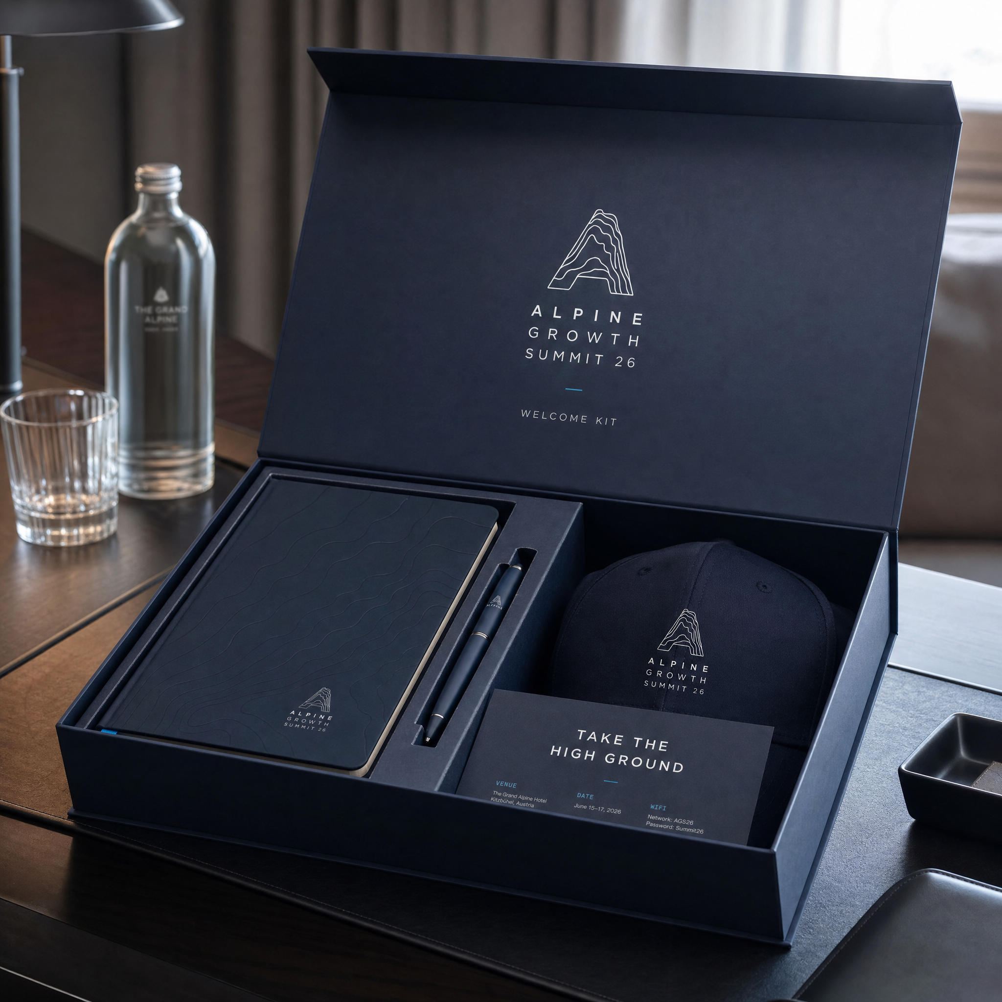
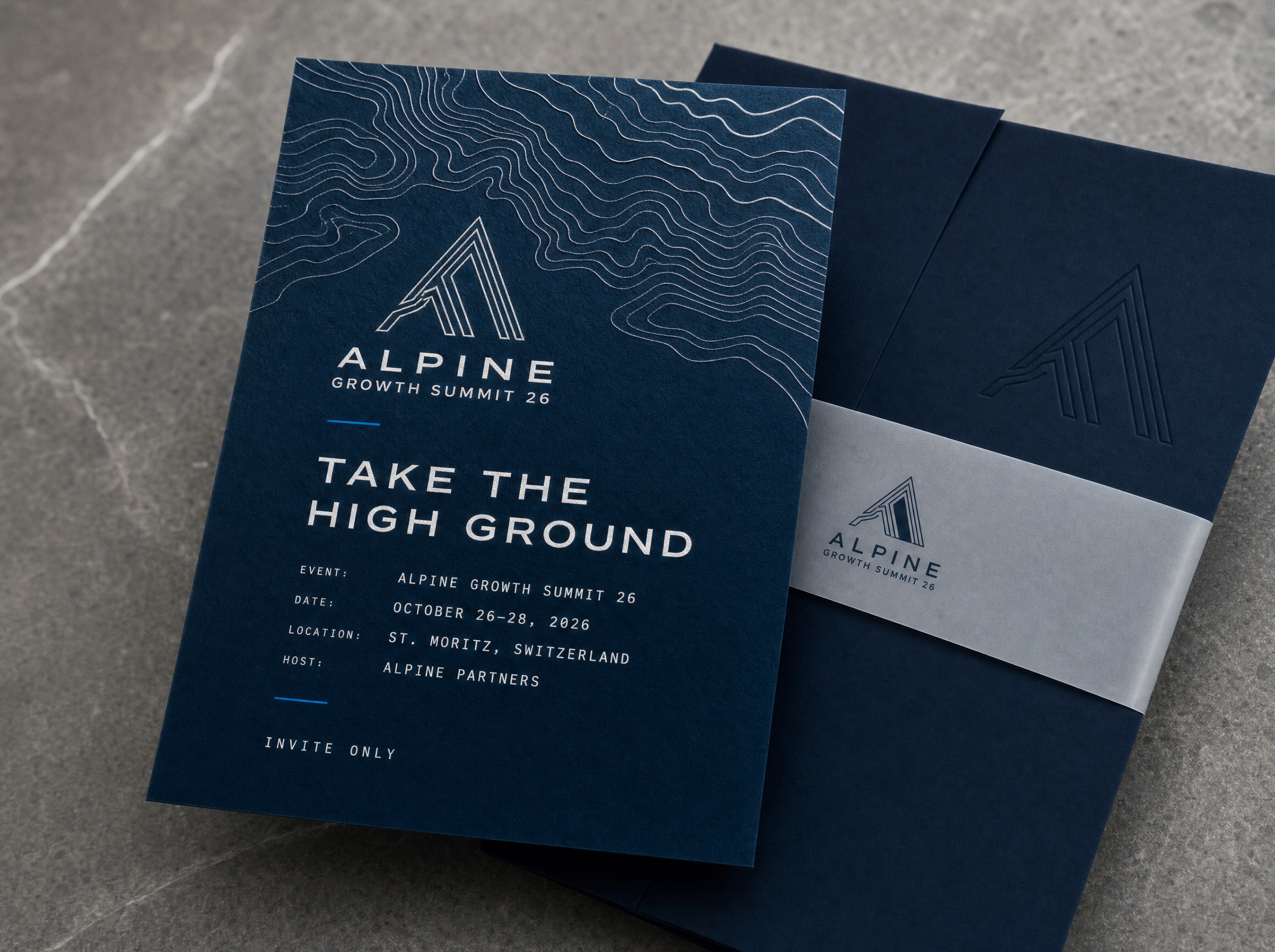
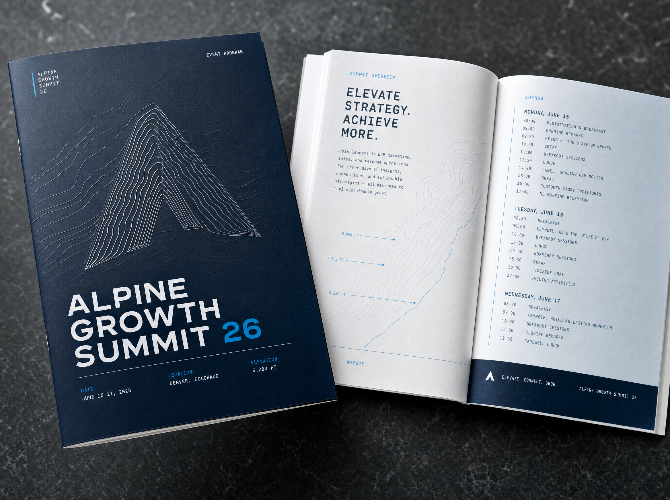
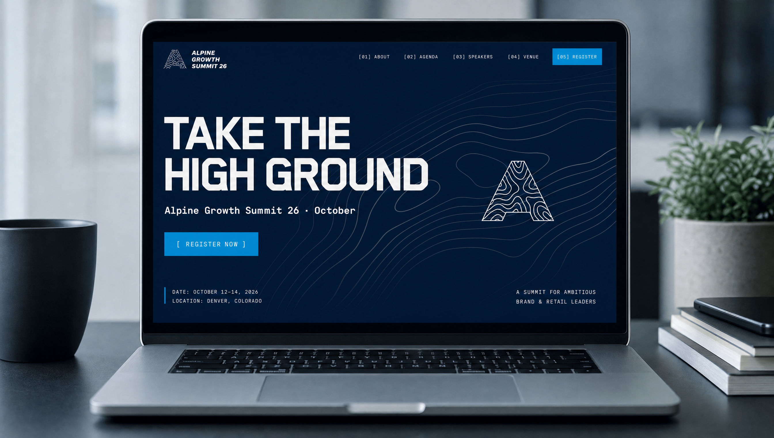
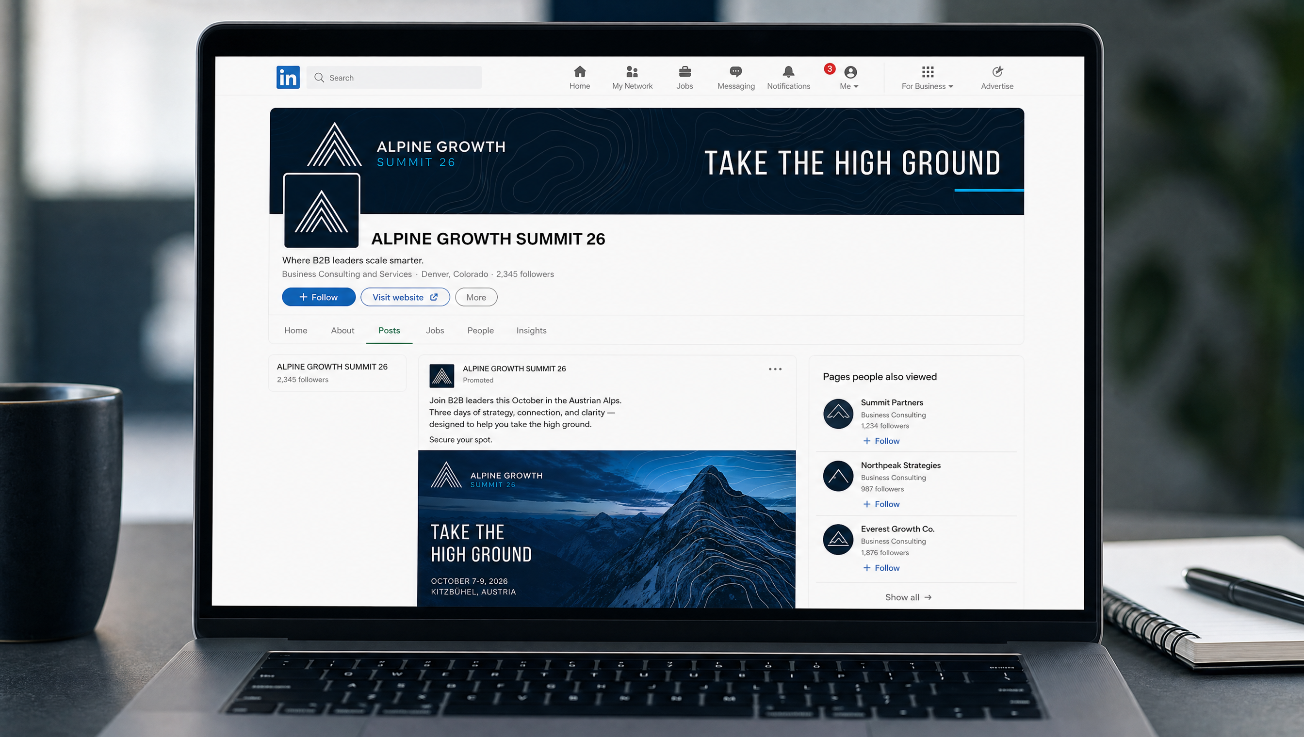
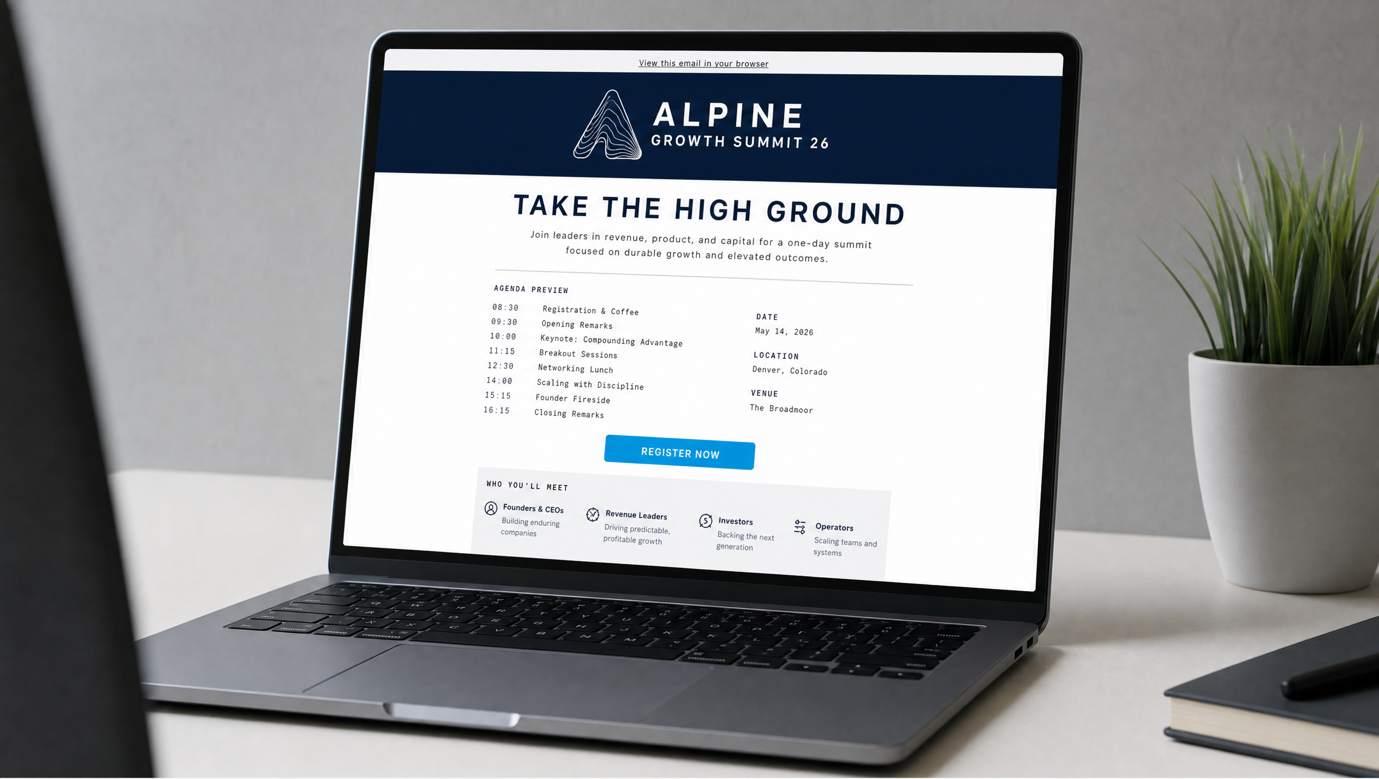
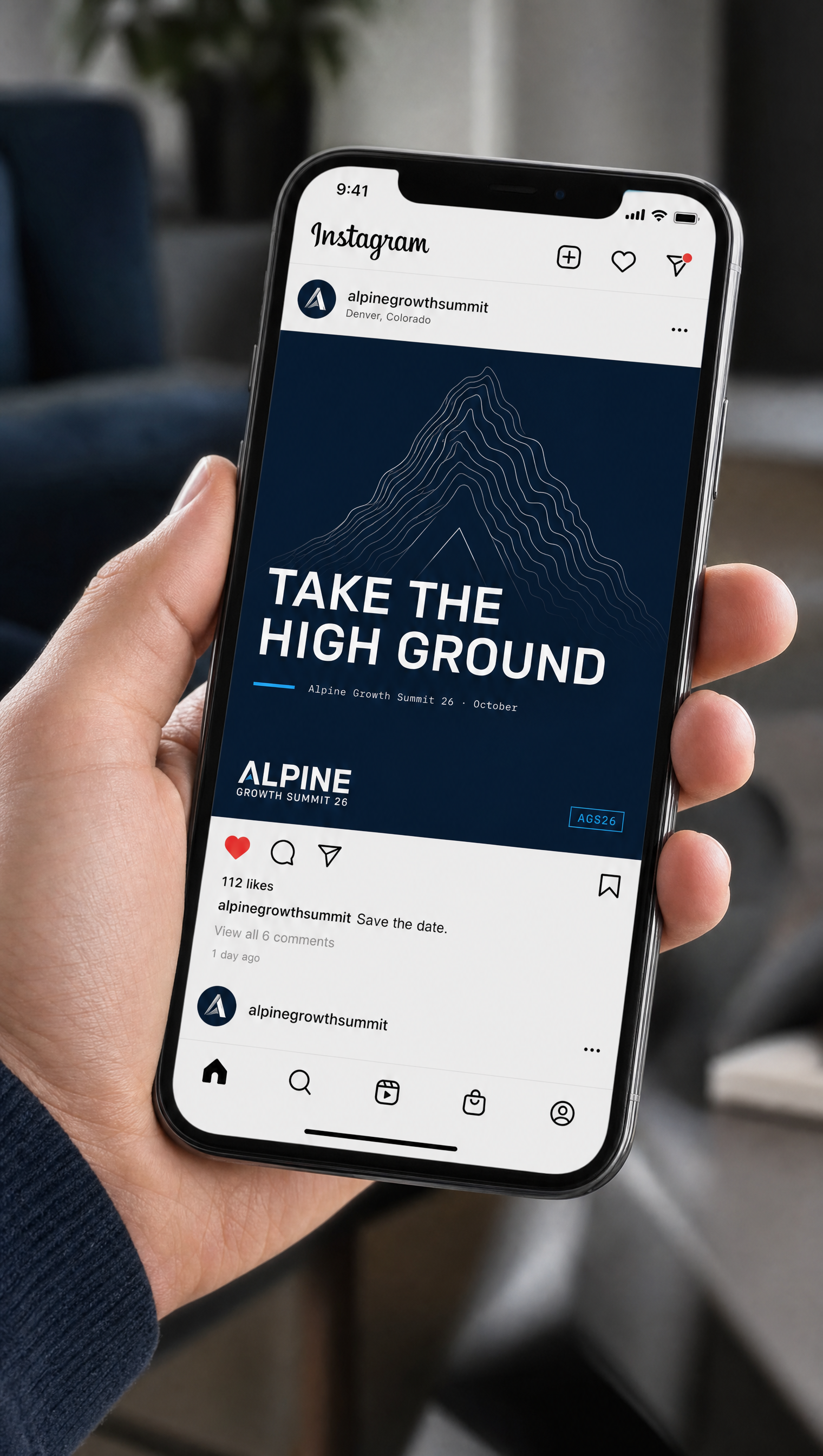
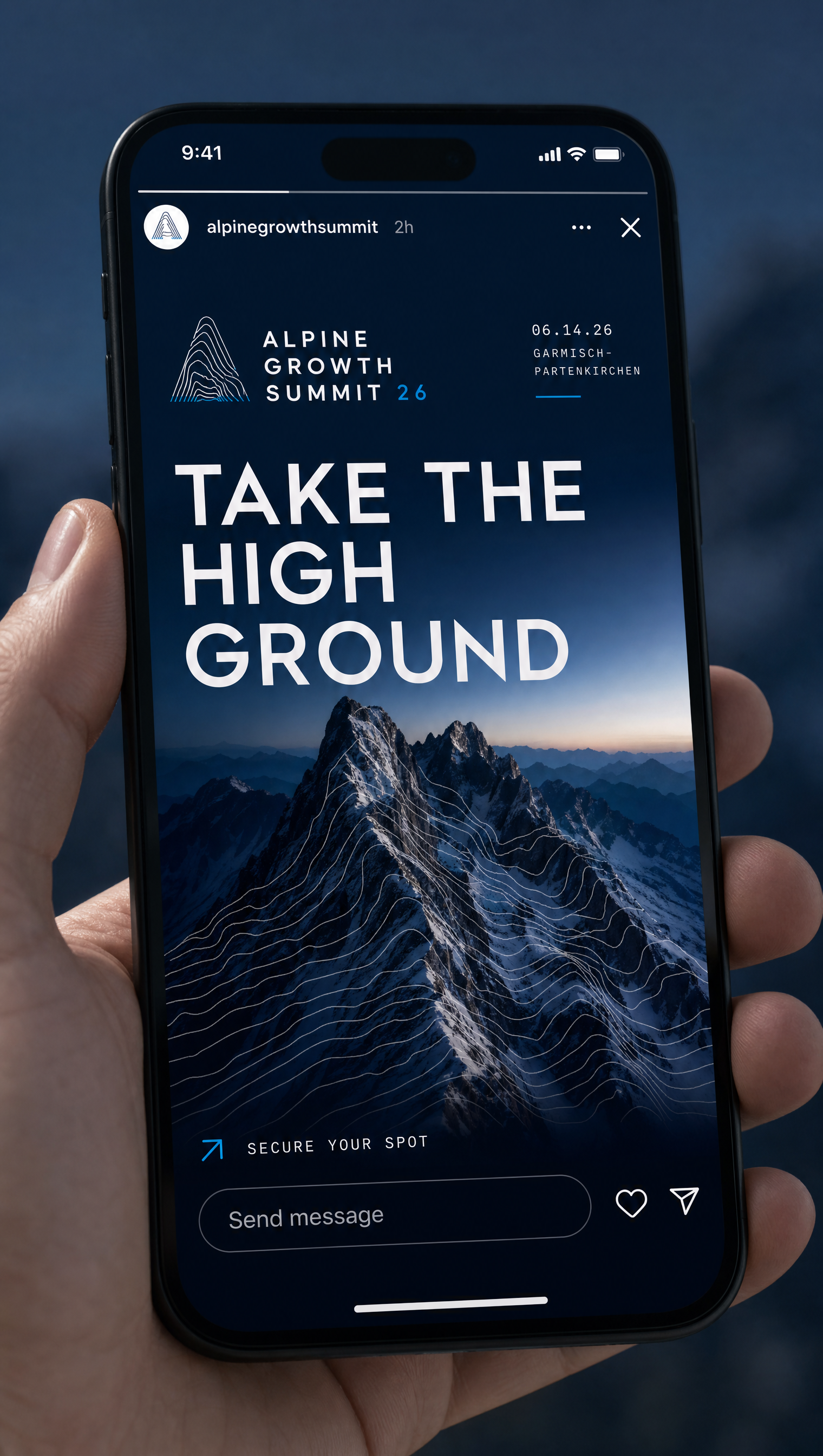
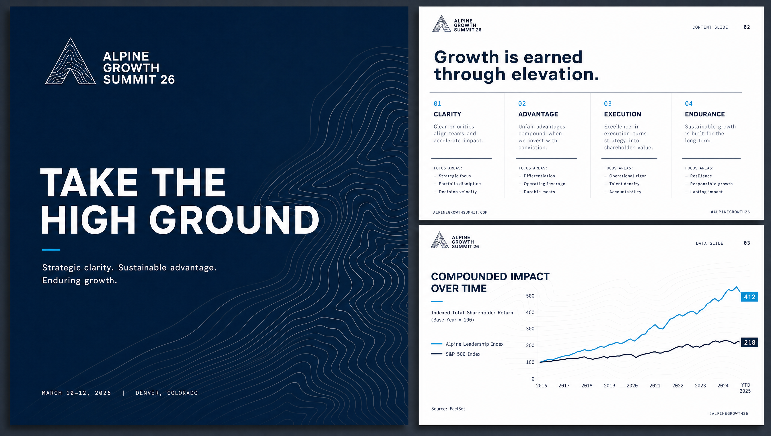
Sixteen applications carried over from the Visual Identity stage — proof the Altitude system holds from a phone screen to a full main-stage build.
Palette direction
Deep navy anchors with authority; royal blue is the confident primary; sky blue brings energy and clarity; pale blue and cloud keep the system breathing. Consistent across every concept.
Typographic system
Aa — the climb
A geometric grotesque for headlines and statements. Confident, modern, a little warm.
Aa — clear & legible
A neutral, highly readable workhorse for body, UI, and wayfinding.
Aa — labels / data
Monospace for eyebrows, kickers, metadata, and figures — rigor and precision.
Campton carries confidence, Inter carries clarity, JetBrains Mono carries rigor. The pairing holds across all three concepts.
Three concepts presented for selection. On approval, the chosen direction advances to Stage 05 — Visual Identity — where it's built into a full system. Palette and typography carry across whichever concept is selected.